About Project
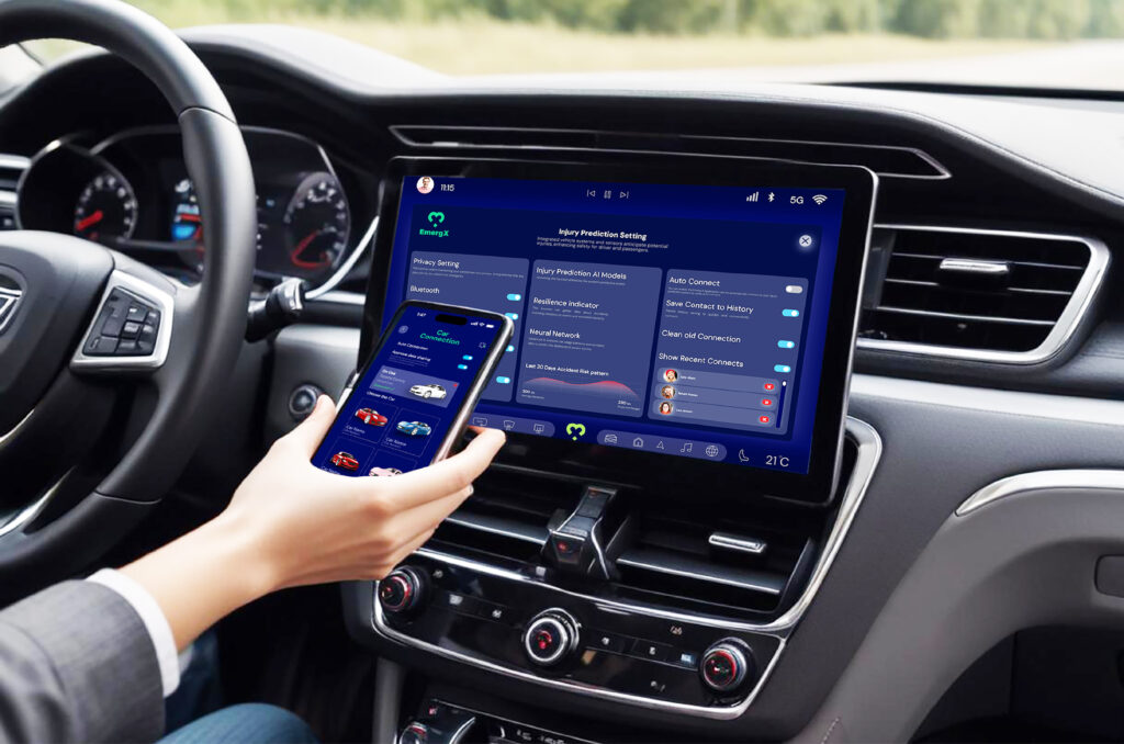
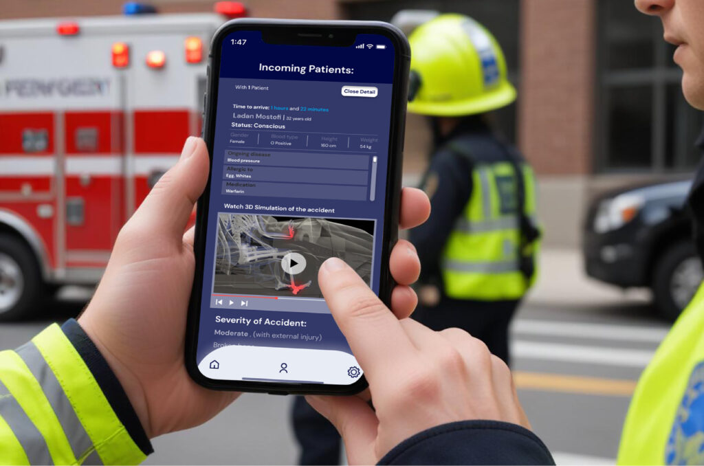
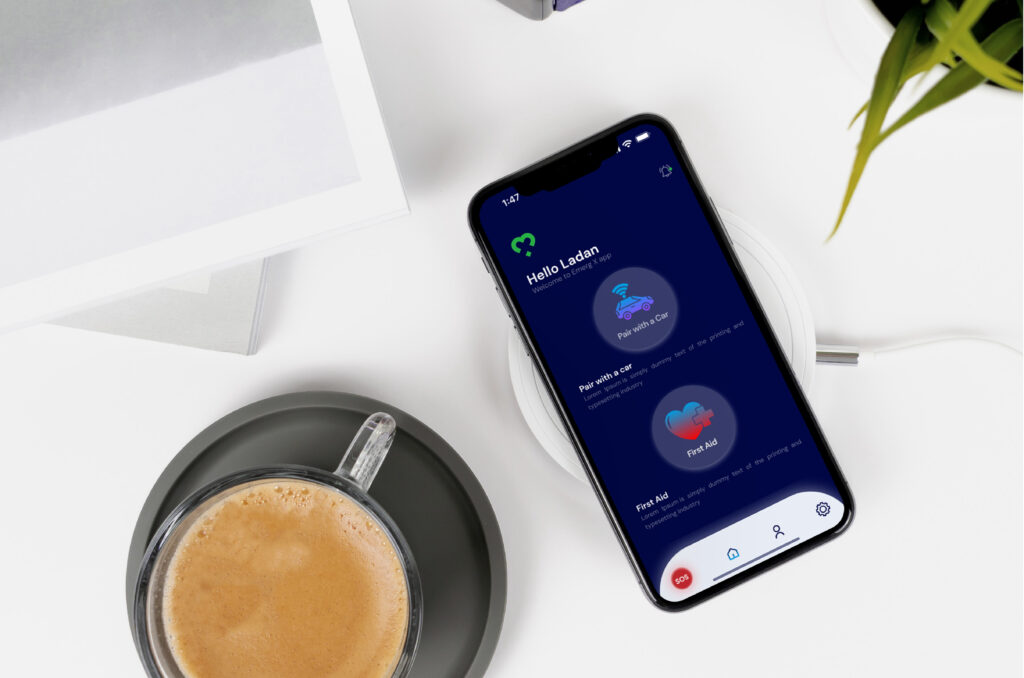
In this research project, the focus was on integrating safety technologies, particularly in automobile design, to reduce healthcare delays and improve early injury risk assessment. The project aimed to develop a user interface design to facilitate the collection of crucial medical and car crash information to transfer crucial information to healthcare providers following automobile accidents.
Design Process
UX Research
Online Research
Interviews
Mind Mapping
Pugh Chart
Google Form
SWOT Analysis
User Persona
Creating Primary and
Secondary Person
User Journey Map
Visual Identity
Logo Design
Color Palate
Type Face
Prototype
User Fellow
Wireframe
Lo-Fi Prototype
Hi-Fi Prototype
User Journey Map
The user journey mapping was analyzed to categorize users’ challenges and needs into distinct groups. This systematic process helped identify recurring patterns and themes among users’ experiences. The categorization helped understand the complexities of users’ experiences, identify common trends, and prioritize areas for improvement in the final concept.
Target Group
General User
Health Care personnel
Needs
Standardized handover: Uniform relay of critical patient info.
Improved communication: Thorough on-site evaluations.
Patient resources: Culturally appropriate education.
Medical background: Access victims’ history.
Telemedicine: Remote follow-ups.
Accurate details: Know the time and extent of the crash.
Challenges
Incomplete info: Delays in orthopedic diagnosis and treatment.
Poor communication: Lost info between ambulance and hospitals.
Complex procedures: Hard for patients and families to understand.
Limited history access: Difficult to understand past injuries and complications.
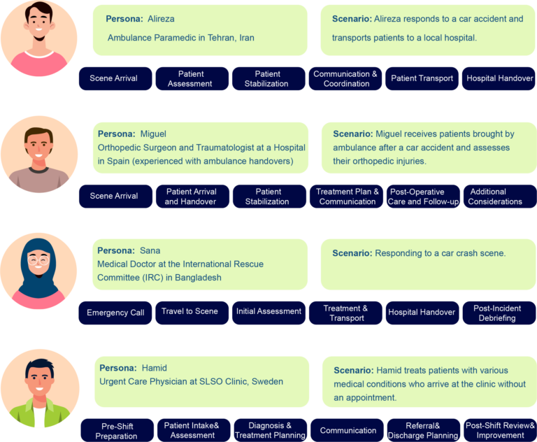
Concept Creation
The insights I obtained from feedback from healthcare personnel, combined with insights derived from the literature review and discussions with Autoliv’s engineers and designers, led me to start my concept sketches.

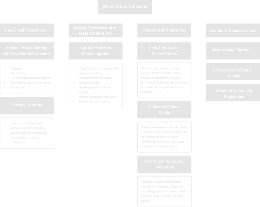
Mind Mapping
In this step, I decided to use mind mapping as a tool. I feel that mind mapping is an effective method for organizing and classifying the characteristics of each notion. This technique allows for a more systematic investigation of the numerous parts inside the concepts, making it simpler to evaluate and comprehend their distinct components.
SWOT Analysis
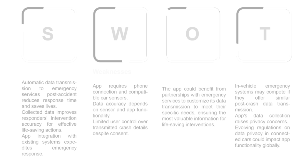
Swot analysis, which stands for Strengths, Weaknesses, Opportunities, and Threats, is a prominent model in business and management for evaluating the internal and external aspects that influence an organization’s strategic position.
Visual Identity
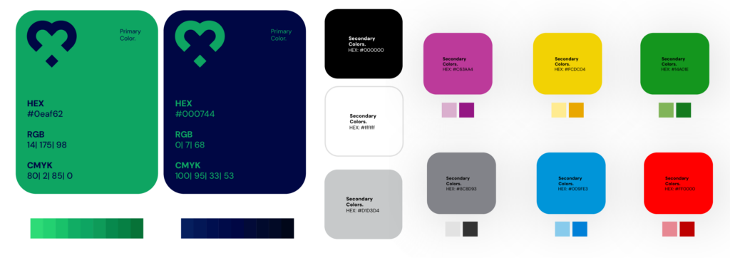
The EmergX logo is an abstract mark that combines a heart symbol with negative space to create an ‘X’ shape, subtly referencing emergency healthcare personnel.
Primary
Color
Green: Symbolizes safety and well-being, a good choice for success messages or confirmation screens.
Dark Blue: Evokes trust and calmness, suitable for less critical elements like background accents or informational text.
Secondary
Color
White/Light Gray: Represents neutrality and provides a clean background for displaying information clearly on the screens and throughout the app.
Black: a neutral and bold color, that symbolizes sophistication, luxury, power, mystery, and formality, often used in high-end brands and minimalist or modern aesthetics.
Complementary
Color
The selection of complementary colors was inspired by Autoliv Brand Identity, a choice deemed essential for our application design, with Dark and Light Tint of them.
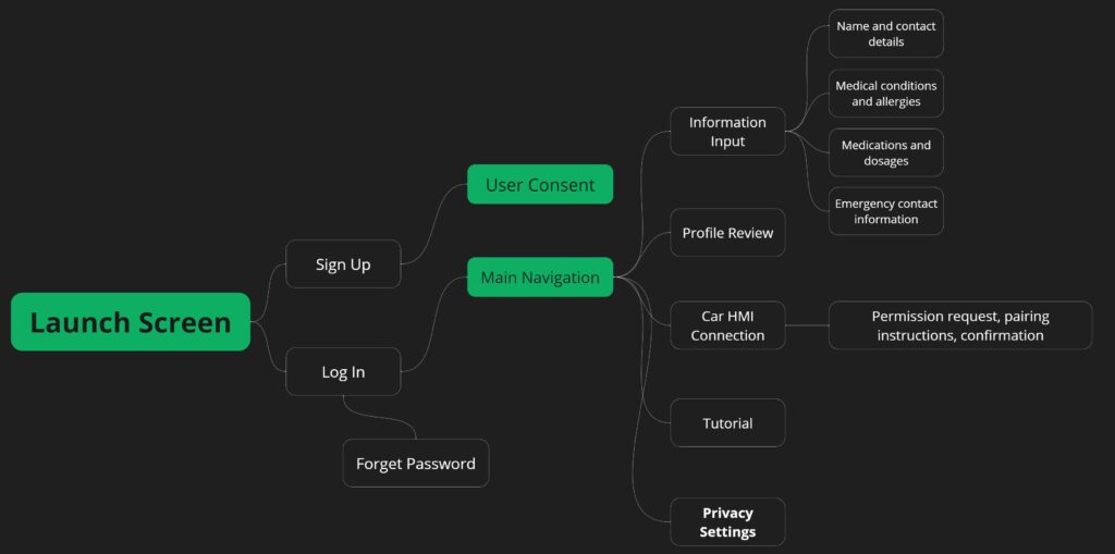
User Flow
User Flows provide visual guidance by outlining user interactions and objectives within the program. These diagrams describe the user experience, help designers anticipate user needs, and ensure coherent, efficient app functionality.
Wire Frame

User Test
Conducted in-person usability testing with general users and medical professionals on a high-fidelity prototype. Open-ended questions alongside specific scenarios were used to explore user experience across various application aspects.
Feedbacks obtain from these tests:
• Ease of use
• Perceived usefulness
• Desired functionalities
• Identification of any ambiguities
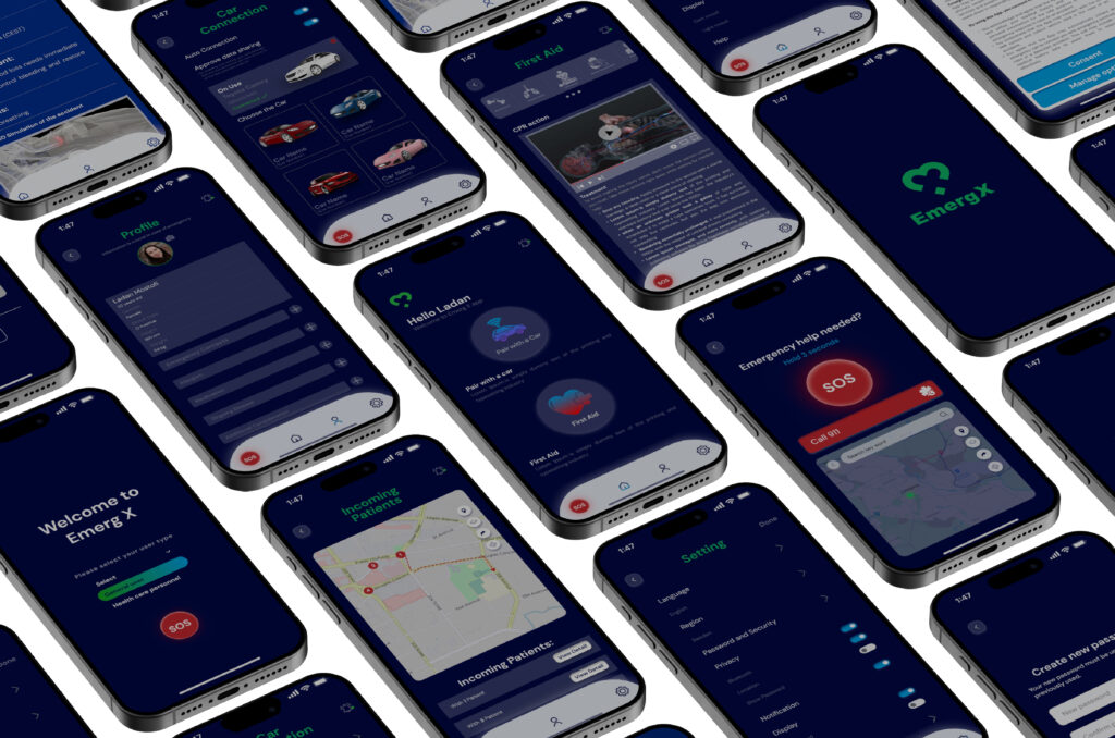
Final Prototype preview
