Autoliv AB · 2024

EmergX: Injury Prediction

A car crash sends data before it sends a patient. EmergX turns crash sensors into a briefing responders can read in the eight seconds they actually have.

My role
Product Designer, end to end
Timeframe
Spring 2024 · 5 months
Status
Validated prototype
FigmaIllustratorResearch through DesignAutomotive HMI
EmergX: Injury Prediction for Autoliv AB, interface preview
2
Role-based interfaces from one data model
4
Clinician journeys mapped across 4 countries
1
Emergency call per crash, not one per phone

The ambulance doesn't need more data. It needs the four facts that change the first decision, and it needs them before the doors open.

01

The problem

Crash data already exists in the car. None of it reaches the people treating the patient.

Responders arrive with a phone call: a location, maybe a car count. Blood type, medication, consciousness and impact severity are all discovered on scene.

Every handover between ambulance and hospital loses information again, four clinicians in four countries described the same gap.

02

Process

  1. 01

    Frame

    On-site at Autoliv, plus a literature review, to isolate a workable slice: post-crash, the first minute, not pre-crash prevention.

  2. 02

    Research

    Four semi-structured interviews with clinicians across Sweden, Iran, Bangladesh and Spain; journey maps for each role.

  3. 03

    Diverge

    Four concepts (VR triage, thermal seat sensors, car black box, mobile app) mind-mapped and scored in a Pugh chart.

  4. 04

    Design

    Brand, user flow, wireframes, then two role-based hi-fi interfaces plus a car HMI companion.

  5. 05

    Validate

    Moderated testing with a physician, a witness and general users; the interface changed on every round.

03

Research & discovery

The brief was 'injury prediction'. I narrowed it to the post-crash minute (where prediction changes treatment) and went to the people who work in it.

4
Clinician interviews, 4 countries
4
Journey maps, scene to follow-up
19
Survey respondents on naming & features
1 min
The window the design targets

Methods

  • Semi-structured interviews with emergency clinicians and paramedics
  • Journey mapping per role, actions, touchpoints, emotions, pain points
  • Concept mind-mapping across four technology routes
  • Pugh chart to score concepts against feasibility and life-saving value
  • SWOT on the selected concept before committing to UI
  • Google Forms survey for naming and feature expectation

Who I spoke to

RoleTools usedFocus
Urgent care physician (Sweden)Handover notes, clinic recordsIncomplete handovers, language barriers, referral delays
Ambulance paramedic (Iran)Radio dispatch, ambulance kitWrong scene information, unknown casualty count
Field doctor, IRC (Bangladesh)Emergency calls, portable kitNo medical history, no risk picture before arrival
Orthopaedic trauma surgeon (Spain)Imaging, medical recordsInjury detail lost between ambulance and hospital

Incomplete information in the handover delays care exactly where speed matters, post-crash trauma.

Urgent care physician, Sweden

To intervene properly I need to know the medical background of the people in the crash, and the exact time and force of it.

Orthopaedic surgeon, Spain
04

What the research showed

The gap is information, not equipment

Every clinician described arriving under-informed rather than under-equipped. The decisive facts (consciousness, blood type, medication, impact force) exist somewhere, just never with the responder.

Design need · Push a structured briefing ahead of the patient, not a phone call.
Handover is where detail dies

Ambulance to hospital is a verbal, non-standard transfer. Orthopaedic detail in particular was routinely lost, forcing re-assessment on arrival.

Design need · One record that travels with the patient, readable by both roles.

Severity needs a clinical grammar

In testing, a physician rejected generic 'light / moderate / severe' labels. Severity is read by body region and by whether trauma is external.

Design need · Classify by body region plus external-trauma flag, and state consciousness first.

Automation without arbitration creates chaos

If every passenger's phone auto-dials emergency services, one crash becomes five reports and dispatch loses time triaging duplicates.

Design need · Route through the car's HMI so one crash emits one authoritative call.

07

The concept

Four routes, one scored decision

VR triage training, thermal seat sensors, a car black box, and a connected mobile app. A Pugh chart against life-saving value, data reliability, privacy exposure and feasibility pushed the mobile app plus car-HMI pairing to the front: it reuses sensors cars already ship and carries the one thing sensors can't infer, the occupant's own medical profile.

Four routes, one scored decision
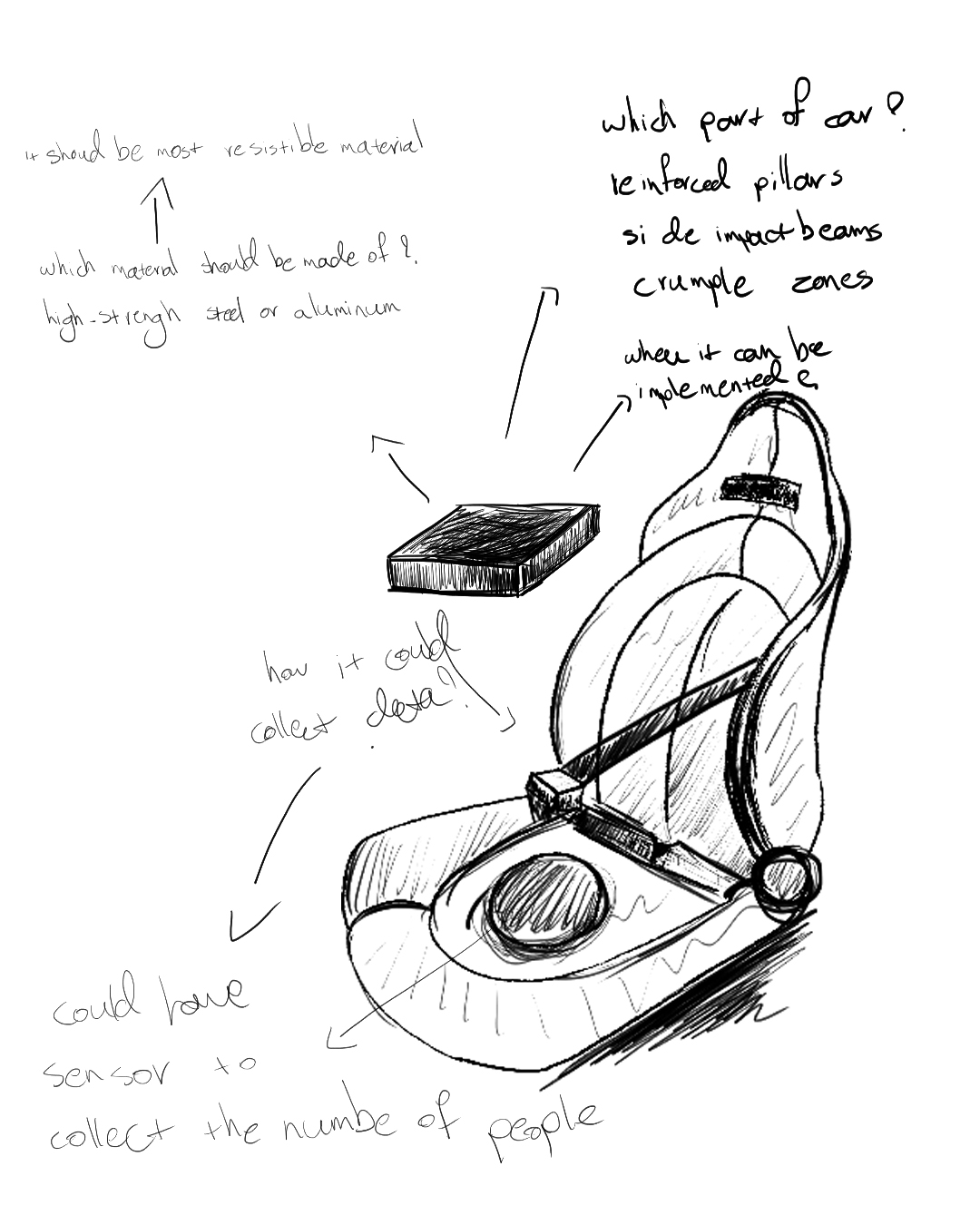
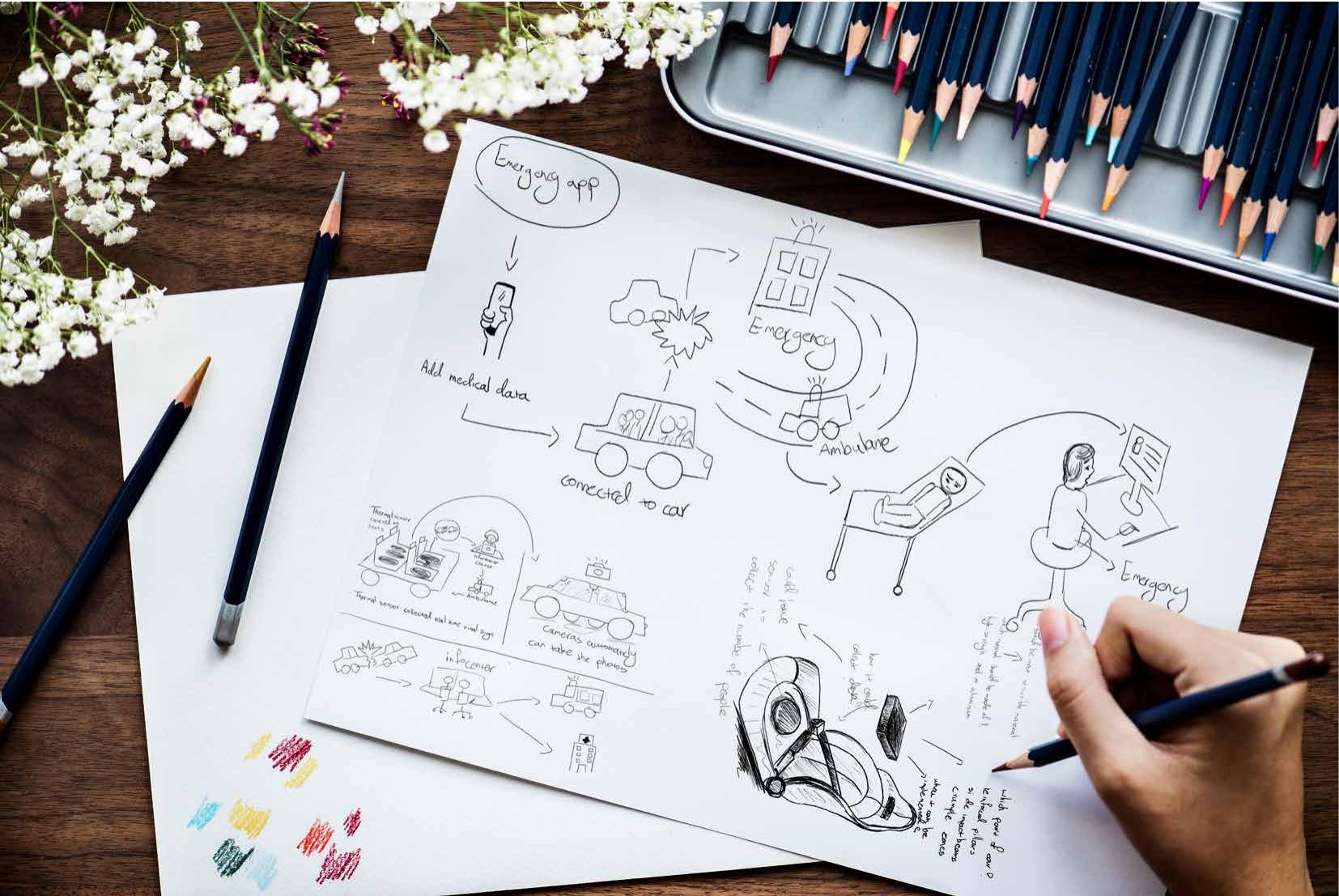
Concept sketching, emergency app, thermal sensing, in-car camera capture and the information-centre relay.

Sensor fusion, defined at the seat

Seat sensors count occupants, seatbelt and biometric sensors read restraint and vitals, cameras reconstruct the impact in 3D, and a resilience indicator estimates severity. Each input maps to one fact a responder asked for, nothing was collected because it was available.

Sensor fusion, defined at the seat
Sensor placement study: what each sensor answers, and where it physically lives.

Two users, one data model

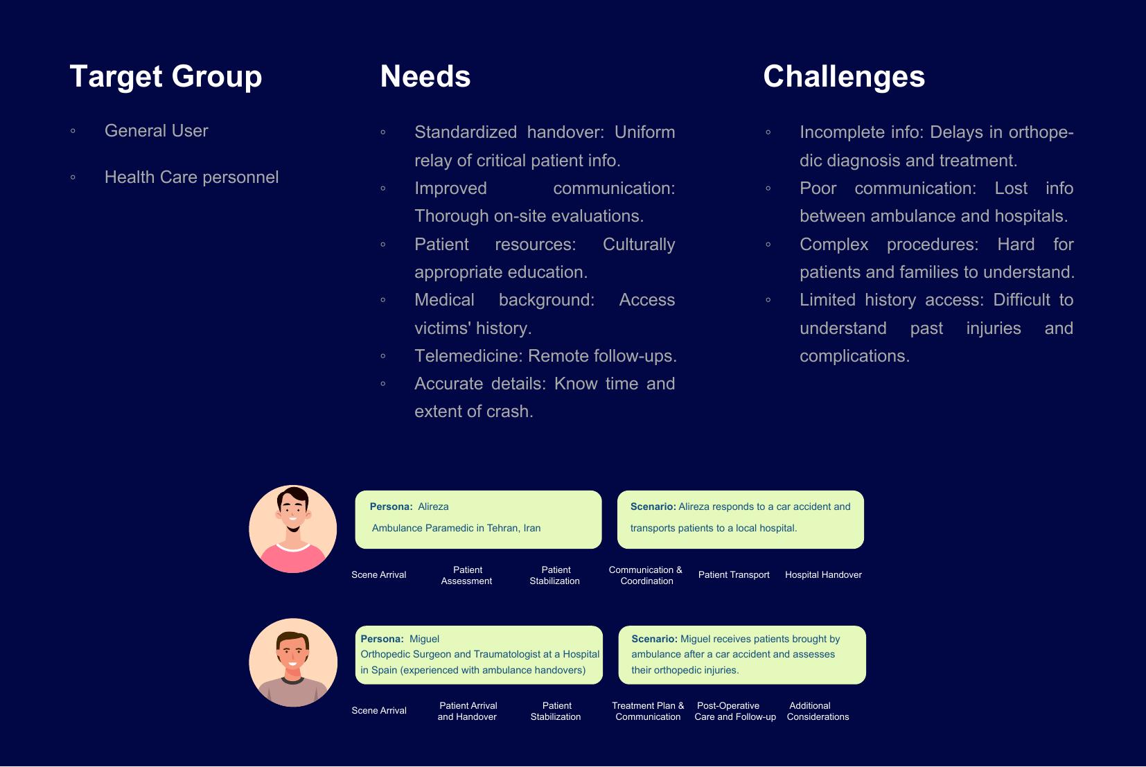
The general user owns and consents to the data; the healthcare user consumes it. Splitting the interface at login kept the driver flow calm and the responder flow dense, without maintaining two products.

Two users, one data model
Target group, needs and challenges, mapped to the two personas driving the split.
08

Prototypes & mockups

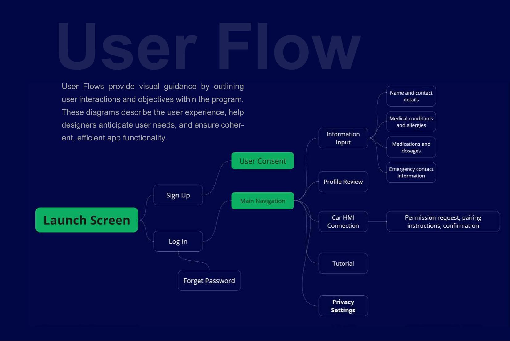
User flow

User flow
Consent placed before profile entry, nothing is stored until the user has agreed to what a crash releases.

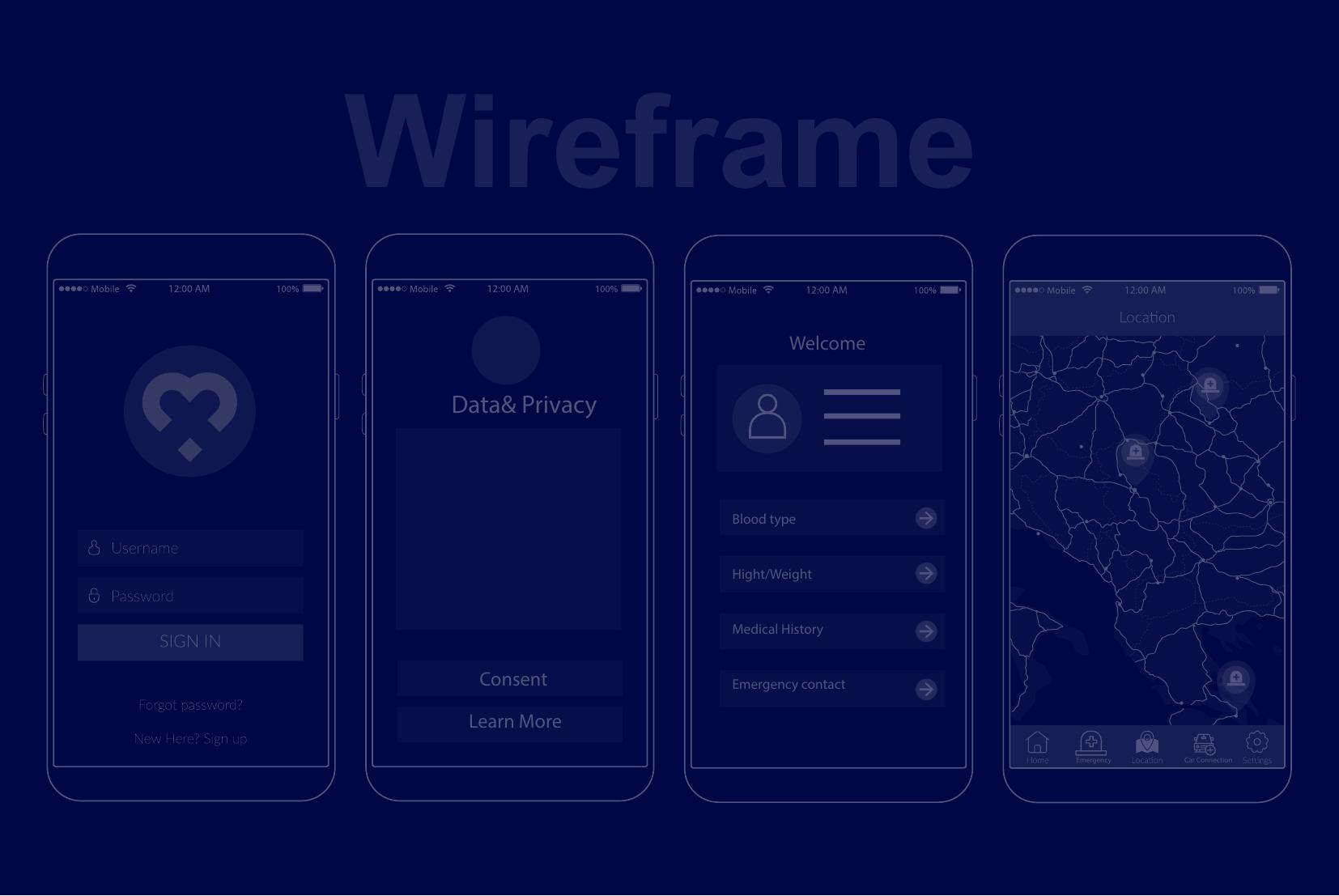
Wireframes

Wireframes
Low-fidelity structure for sign-in, consent, medical profile and location before any visual design.

Hi-fi: general user

Hi-fi: general user
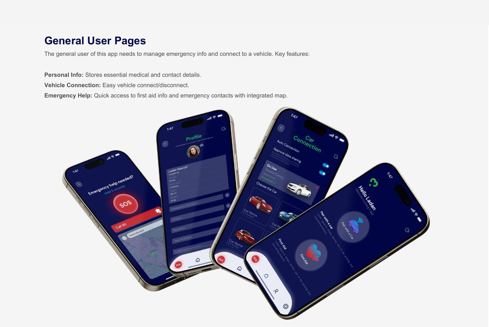
Home, profile, car connection and SOS. One connected vehicle, one exit button, first aid always one tap away.

Hi-fi: healthcare personnel

Hi-fi: healthcare personnel
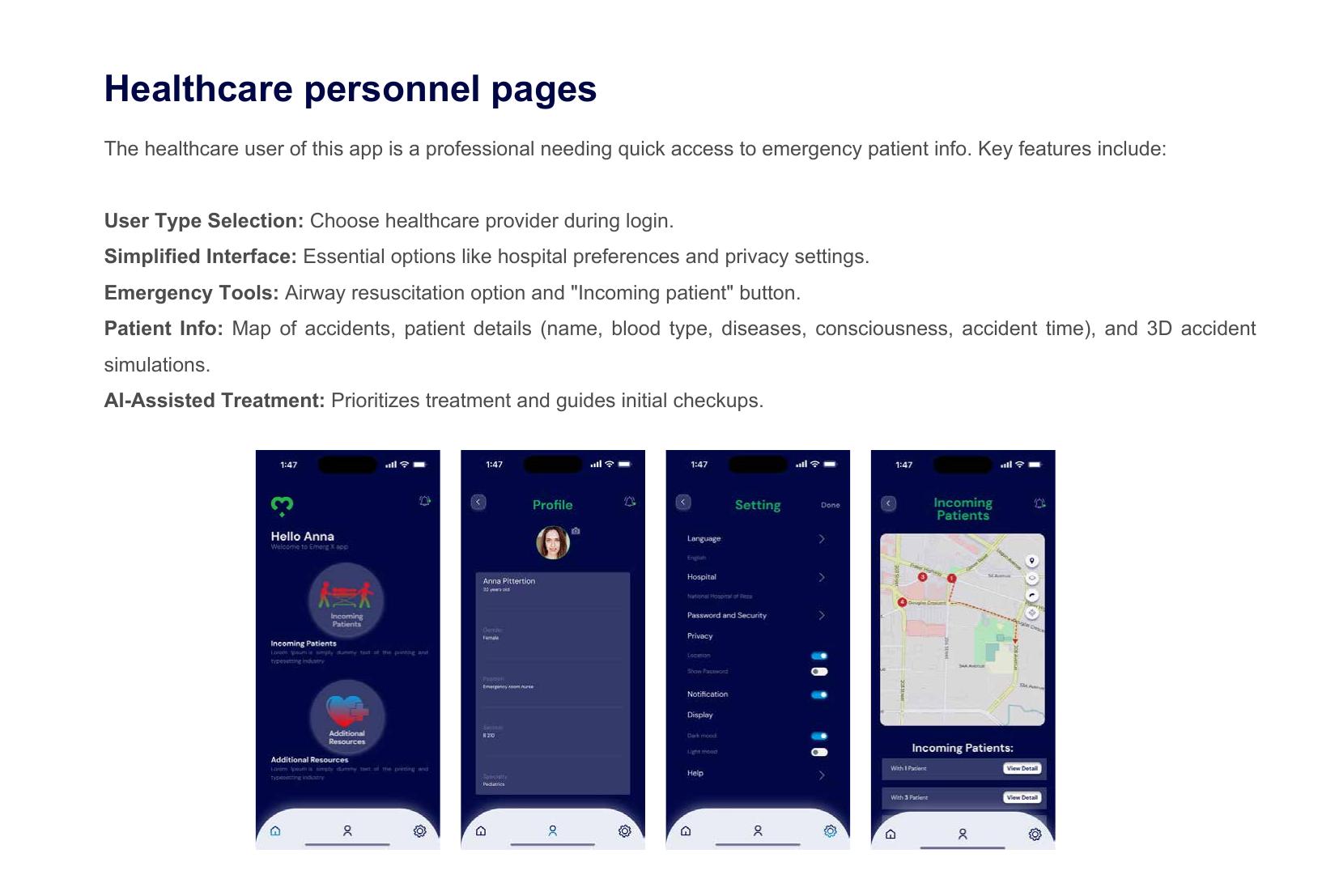
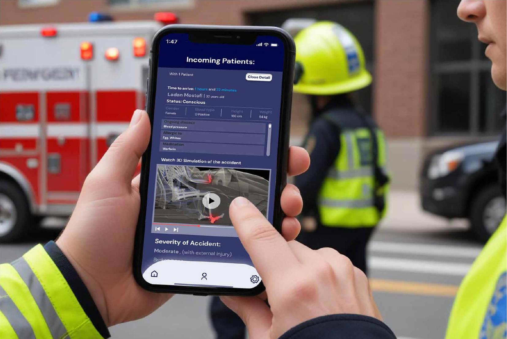
Incoming patients on a map, then per-patient detail: consciousness, blood type, medication, ETA, AI-suggested treatment order.

Car HMI companion

Car HMI companion
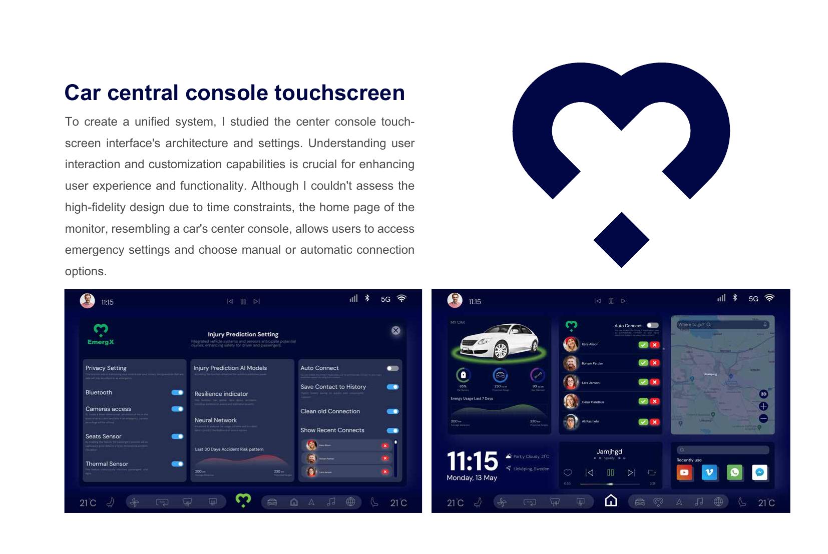
Emergency settings on the centre console: sensor permissions, auto-connect, and the resilience indicator's 30-day risk pattern.

In context

In context
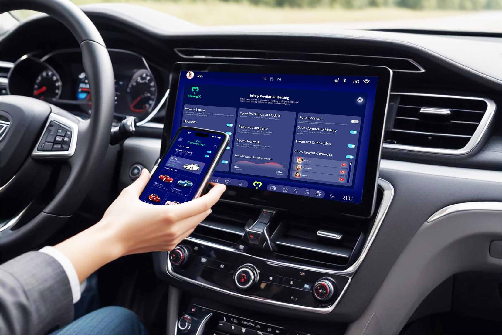
Phone pairs to the console; the car (not the phone) owns the emergency call.

Testing sessions

Testing sessions
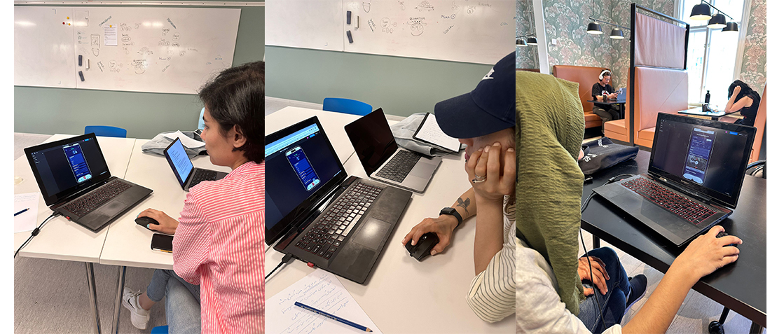
Scenario-based sessions with a physician, a witness and general users, every round removed a screen or a control.
09

Design decisions

Consciousness first, always

A physician said treatment order starts with whether the patient responds. It became the first line of the patient card, above identity.

Severity by body region, not by adjective

A leg fracture with external trauma and a head impact are not the same 'moderate'. The card states region and external-trauma state, and the AI ranking explains itself.

One call per crash

The HMI arbitrates. Passenger phones contribute medical profiles; the vehicle emits the single emergency call.

Consent that fits on one screen

The original consent page was a wall of text with a redundant 'manage options' button. Testers skipped it entirely, so it was cut to a short, scoped statement, release only on a confirmed crash.

3D reconstruction over a damage photo

Photos show the car. A short reconstruction shows the direction and force of impact, which is what predicts internal injury.

Dark, high-contrast interface

Both users read the screen at night, roadside, in a moving vehicle. Deep navy with green status accents holds contrast under headlights and keeps the SOS action unmistakable.

10

Usability testing

Three moderated rounds with a medical professional, an accident witness and general users. Every round removed something.

Participants
1 physician, 1 witness, 3 general users
Format
Moderated, scenario-based, think-aloud
Scenarios
3, onboarding, crash report, incoming patient
Prototype
Figma, clickable
TaskFirst versionAfter testingWhat I learned
Read and accept data consentLong legal page, redundant 'manage options'Short scoped statement, one actionEvery tester scrolled past the original without reading it.
Connect a vehicleTwo competing selection paths, no way to unpairOne list by name and plate, explicit disconnectTesters assumed they were still connected to an old car.
Add medical informationNo visible entry point on profileDedicated add button per field groupUsers read the profile as read-only.
Report an accident as a witnessMap in nav bar, contacts irrelevant to the caseMap inside the emergency call, nav simplifiedA witness reporting for a stranger doesn't need her own contacts.
Assess an incoming patientSeverity as a single generic labelConsciousness, region-based severity, treatment orderPhysician-driven change; also added airway resuscitation to the responder home.

What changed because of the test

  • Consent rewritten and shortened; redundant control removed.
  • Map page deleted and folded into the emergency call, one fewer nav item.
  • Car connection reduced to a single path with an explicit disconnect.
  • Airway resuscitation and 'incoming patient' promoted to the responder home screen.
  • Severity model rebuilt around body region and external trauma, on clinical feedback.
11

How success will be measured

Two role-based interfaces and a car HMI concept, validated against the four clinical journeys that started the project.

Every element on the responder patient card traces to a stated need from an interview or a test session.

SWOT set the honest limits: the concept depends on working sensors and connectivity, and privacy control must stay with the user.

Next steps if built: instrument real dispatch timings, and validate the AI severity ranking against trauma registry data before any clinical claim.

12

Outcomes

Responders get a patient briefing before arrival: identity, blood type, medication, consciousness, severity and a 3D reconstruction of the impact.

Consent is explicit and scoped, medical data is released only by a confirmed crash event.

Routing the call through the car's HMI removed the flood of duplicate emergency calls the concept would otherwise have caused.

Delivered to Autoliv as a validated concept prototype; not shipped to production.

13

Reflection

The brief said injury prediction. The research said the prediction is worthless unless it lands as a decision, in the first minute, in the responder's hand, so I designed the delivery, not the model.

Designing for two roles from one dataset was the leverage point. Splitting at login cost one screen and saved an entire second product.

If I ran it again I would test the responder card with paramedics under time pressure, not seated. Everything I learned about density came from a calm room.

Next

More case studies

Have a similar problem?

I'm available for product design roles and consulting projects.

contact@lidatohidi.com