Visualiseringscenter C, with Skansen · 2023–2024

Food and Future

A six-chapter touch table that turns food-system science into something an eleven year old can play with, decide on, and remember.

My role
UX & Visual Designer: concept, IA, interaction, data visualisation, motion
Timeframe
2023–2024
Status
Installed and running at Visualiseringscenter C
FigmaAfter EffectsData visualisationTouch table
Food and Future for Visualiseringscenter C, with Skansen, interface preview
6
Chapters, one idea each
5
Interaction modes in one table
11+
Designed for age eleven and up

Children do not learn from data. They learn from play. So every fact in this table sits behind something you touch, compare, or watch first.

01

The problem

Food-system science is statistical, contested and abstract. In a museum it competes with everything else in the room.

The audience starts at age eleven, arrives in groups, and gives an installation a few seconds before walking on.

Skansen's research archive held the substance but no narrative: hundreds of figures with no order, no hook and no takeaway.

A touch table has no manual and no onboarding. Whatever it teaches has to be learned by touching it.

02

Process

  1. 01

    Content analysis

    Read the Skansen article archive with their educators and scientists, and pulled out the handful of numbers that actually change a visitor's mind.

  2. 02

    Narrative & IA

    Turned those numbers into six chapters with one idea each, and a start screen that offers three ways in: explore, guided auto-play, or an idle attract loop.

  3. 03

    Interaction design

    Designed the touch grammar: large tap targets, one level of disclosure per tap, filters that never empty the screen, and a way back from anywhere.

  4. 04

    Data visualisation

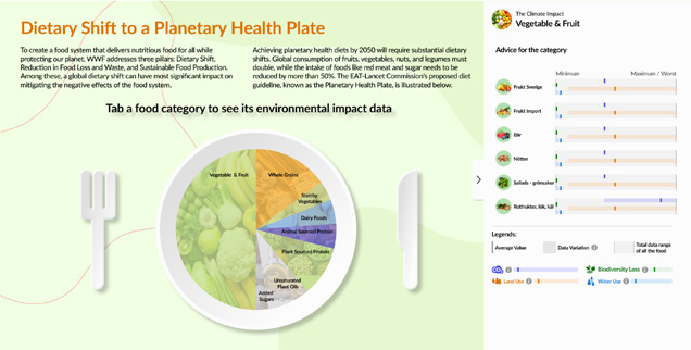
    Built the comparison scatter plot, impact dimensions and the Planetary Health Plate so children compare foods by touching them, not by reading axes.

  5. 05

    Motion & storytelling

    Storyboarded and animated the food-waste film so the scale of the problem lands before any statistic appears.

  6. 06

    Validation

    Walked the flow with Skansen educators and floor staff, then adjusted reading level, tap sizes and pacing on their feedback.

03

Research & discovery

The research was not user interviews first, it was content first. Skansen's scientists knew the science; my job was to find which parts of it survive contact with a distracted eleven year old, and how the table should behave so nobody needs an instruction.

38%
Of global food-system energy goes to food that is never eaten
8–10%
Of greenhouse gas emissions come from wasted food
25%
Of agricultural water is spent on food we throw away
60%
Of food waste happens in households

Methods

  • Archive analysis of Skansen articles and research summaries with their subject experts
  • Fact selection sessions: keep a number only if it changes a decision
  • Reading-level and vocabulary pass for age eleven and up, in Swedish and English
  • Walk-by observation of how visitors approach a table with no attendant
  • Touch ergonomics study: reach, target size and text size at table height
  • Flow walkthroughs with educators and floor staff before build

Who I spoke to

RoleTools usedFocus
Skansen scientistsResearch archive, article setScientific accuracy, what may and may not be claimed
Skansen educatorsSchool programmesReading level, curriculum fit, group behaviour
Visualiseringscenter C teamTouch table hardware, exhibition floorAttract loop, durability, throughput
Yin He, design collaboratorFigma, After EffectsVisual system and animation production

If it takes a paragraph to explain, they have already walked away.

Skansen educator, content workshop

The number has to be true, but the story is what they take home.

Skansen scientist, archive review
04

What the research showed

Groups arrive, not individuals

School classes crowd the table three or four at a time. A single-focus interface creates a queue and the rest lose interest.

Design need · Wide, forgiving tap targets and content that reads from the side of the table, not only head-on.
Numbers alone do not convince children

A percentage means nothing without a comparison. Visitors understood impact only when two foods sat next to each other.

Design need · Comparison as the primary interaction, with the number as the reward for comparing.

Nobody reads an intro screen

Standing visitors skip framing text and touch whatever moves. The instructional model had to be replaced by an attract loop.

Design need · Three entry paths: free exploration, an auto-play guided tour, and an idle highlight loop that demonstrates the interaction.

The emotional beat has to come before the data

Food waste only registered once visitors saw it: cut fruit, expired packets, full bins, at scale.

Design need · Open the food-waste chapter with animation, then reveal the figures behind it.

Learning needs a personal ending

Visitors asked the same closing question: so what should I do? Without an answer the visit ends as guilt, not as agency.

Design need · A short quiz that converts the chapter into one concrete personal action.

Accuracy limits are part of the design

The impact data varies by production method and region, and the scientists would not let it read as a diet prescription.

Design need · Visible caveats in plain language, framed as an overview rather than advice.

07

The concept

Six chapters, one idea each

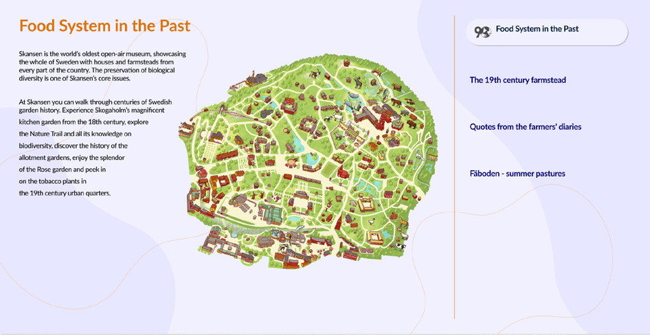
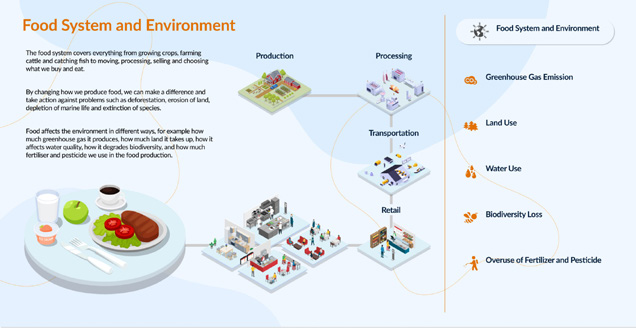
Food System and Environment sets the frame. Food System in the Past grounds it in Skansen's own farmsteads. Environmental Impact Data lets you compare. Food Waste delivers the emotional hit. Dietary Shift shows the plate. What Can We Do turns it into a choice. Any chapter works as a first chapter, because visitors never start at the beginning.

Six chapters, one idea each
Chapter one: the food system as a chain from production to retail, with five impact dimensions to open.

Compare by touching, not by reading axes

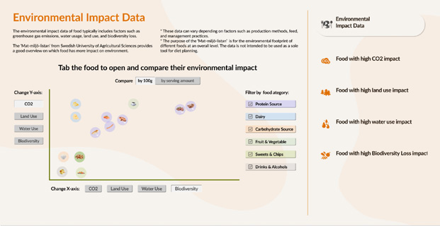
The scatter plot is the heart of the table. Tap foods to open them, switch the axis between CO2, land use, water use and biodiversity, filter by category, or pick a ready-made story if you would rather be guided. Every state keeps something on screen, so a child cannot filter their way into an empty view.

Compare by touching, not by reading axes
Environmental Impact Data: filter, switch dimensions and compare foods side by side.

Play first, facts second

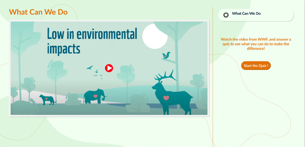
Food Waste opens with the animation, then unfolds into causes, scale and household tips. The Planetary Health Plate is a plate you tap, not a chart you study. What Can We Do closes with a WWF film and a short quiz.

Play first, facts second
Dietary Shift: tap a food category on the plate to see its impact ranges against average values.
08

Prototypes & mockups

The installed touch table

The installed touch table
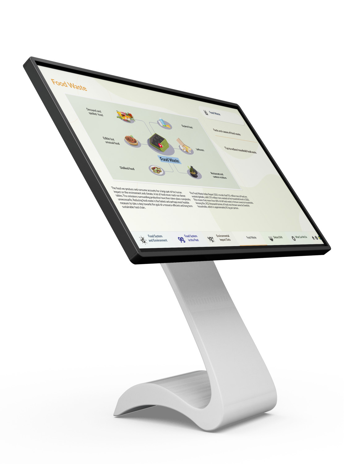
Table-height display, persistent chapter bar along the bottom edge, language toggle always visible.

Food waste, facts and causes

Food waste, facts and causes
Data visualisation carries the argument: four impact bars, four causes, one clear takeaway per column.

Food system in the past

Food system in the past
Skansen's own open-air museum map connects the science to the farmsteads visitors just walked through.

What can we do

What can we do
A WWF film and a short quiz turn the visit into one action a visitor can name on the way out.

Wireframing the chapters

Wireframing the chapters
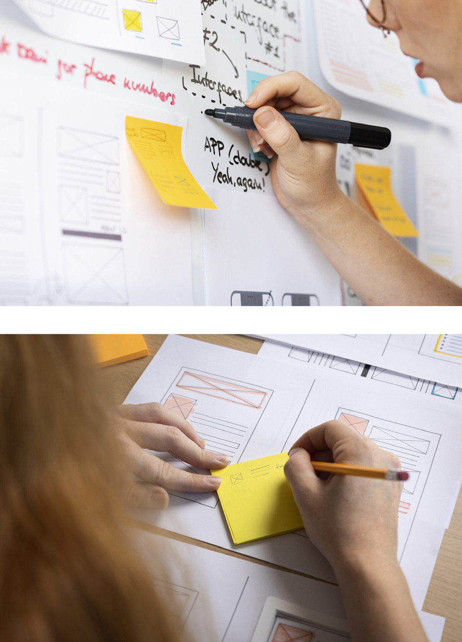
Paper first: layout, tap targets and pacing tested on the table footprint before any pixel work.

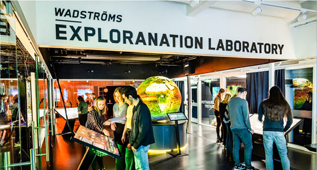
Wadströms Exploranation Laboratory

Wadströms Exploranation Laboratory
The exhibition context the table had to compete with, and be readable inside.
Motion

The food waste animation

Children reach the Food Waste chapter and get a short animated film before a single number appears. It runs on the table and plays here on loop. The script came out of the data analysis: I pulled the key figures from Skansen's archive, decided which four could carry a story, and storyboarded them into four scenes that move from problem to scale to personal impact to action. After the film, the same numbers reappear as data visualisation, and the chapter ends with the quiz.

  1. 01

    The problem

    A montage of cut fruit, expired products and leftovers. We throw away too much food.

  2. 02

    The scale

    A global map animates the tonnage wasted every year, so the number arrives as a picture first.

  3. 03

    The impact

    One person surrounded by empty packaging. The global figure becomes a household figure.

  4. 04

    The solution

    A balanced plate and a recycling bin: reduce, reuse, recycle. The quiz picks up from here.

Team

How we worked together

This was a collaboration, and the case study should say so plainly. The science and the source material came from Skansen's scientists and educators. Yin He and I worked as a two-person design team inside Visualiseringscenter C, splitting the work by strength and reviewing each other's output daily rather than working in separate lanes.

Lida Tohidi

UX & Visual Designer

Content analysis of the Skansen archive, narrative and information architecture for the six chapters, interaction model and touch grammar, data visualisation design (impact comparison, plate, waste figures), the food-waste storyboard and motion direction, and the flow walkthroughs with educators.

Yin He

Design collaborator

Co-designed the visual language and chapter layouts with me, produced illustration and animation assets alongside my storyboards, and built out screen variants for chapters we had scoped together. We divided chapters between us, then swapped for critique so the whole table stayed one system rather than two styles.

Skansen scientists and educators

Subject matter partners

Provided the research archive, verified every figure and caveat, and set the reading level and curriculum fit for visitors from age eleven. They also vetoed anything that read as dietary advice rather than an overview.

Visualiseringscenter C

Host and production

Touch table hardware, exhibition context and the attract-loop requirement, plus the floor testing that shaped tap sizes, text sizes and pacing.

09

Design decisions

Animation before statistics

In the food-waste chapter the film runs first and the figures follow. Reversing that order lost visitors in testing walkthroughs: they read one number and left.

Three ways in, no instructions

Explore freely, take the guided auto-play tour, or let the idle loop show you what a tap does. Nobody has to be told how the table works.

Comparison as the core interaction

Impact is only meaningful relative to something else, so the scatter plot is built for two foods at a time, with axis switching instead of a legend to decode.

Never show an empty state

Filters and category toggles always leave content on screen. On a walk-by table an empty result reads as a broken machine.

Honest caveats in plain language

The impact data varies by production method and region. That is stated on the chapter itself, in a sentence a child can read, not buried in a credits screen.

End with a choice, not a warning

The final chapter is a film and a quiz. Visitors leave with one action they picked themselves, which is the only outcome the educators cared about.

11

How success will be measured

Success for this table is behavioural: do visitors stop, do they reach chapter three, and can they name one action at the end.

Educators walked the full flow before build and set the bar for reading level and pacing; their notes drove the final text pass.

Every figure on screen traces back to a Skansen source and was signed off by their scientists.

If instrumented further, the next measures are dwell time per chapter, quiz completion rate, and which comparison foods children choose most.

12

Outcomes

The installation runs at Wadströms Exploranation Laboratory, Visualiseringscenter C, as a public exhibit rather than a concept.

Children move through it by playing: tap a food, compare it, watch a short film, then answer a quiz that turns the visit into a personal decision.

Skansen's research became a narrative the floor staff can teach from, and the visual system carried into supporting exhibition material.

The quiz closes the loop: visitors leave with one thing they can change, not with a statistic they will forget.

13

Reflection

The hardest edit was subtraction. The archive could have filled twenty chapters; the table works because it holds six, each with one idea.

Designing for children raised the bar for everyone. Larger targets, shorter sentences and comparison-first interaction made the table better for adults too.

Working two-up with Yin He taught me to hand off unfinished work early. Daily critique kept one visual system across chapters we designed separately.

Next time I would test the attract loop on the floor sooner. It is the single element that decides whether anyone touches the table at all.

Next

More case studies

Have a similar problem?

I'm available for product design roles and consulting projects.

contact@lidatohidi.com