Intersolia · 2025

SDS WorkHub

Three legacy desktop tools, thirteen years of workarounds. Redesigned into one AI-assisted web workbench for the Safety Data Sheet department.

My role
Sole designer, research, service blueprint, IA, wireframes, prototypes, handoff
Timeframe
4–6 months (discovery → validation)
Status
Prototype validated with users; high-fidelity design and handoff in progress
FigmaMiroService designAI-assisted UX
SDS WorkHub for Intersolia, interface preview
3 → 1
Tools merged into one platform
17
Root-caused issues addressed
~40%
Manual matching time targeted

The department didn't need faster tools. It needed one system that remembers what happened, and a customer request form that stops creating the work in the first place.

01

The problem

The SDS department ran on three isolated desktop tools (Requester, Handler, Entry Tool) with no shared data and no automated handoff.

Every action took 30–60 seconds, so specialists kept three windows open just to keep working.

Nothing was traceable. Teams chat and personal Excel trackers had become the real system of record.

Most duplicates and wrong-language sheets were created upstream, in the customer request form nobody had questioned.

Before

The tools as they were

What a specialist opened every morning. Three unrelated applications, none aware of the others, all real production screens.

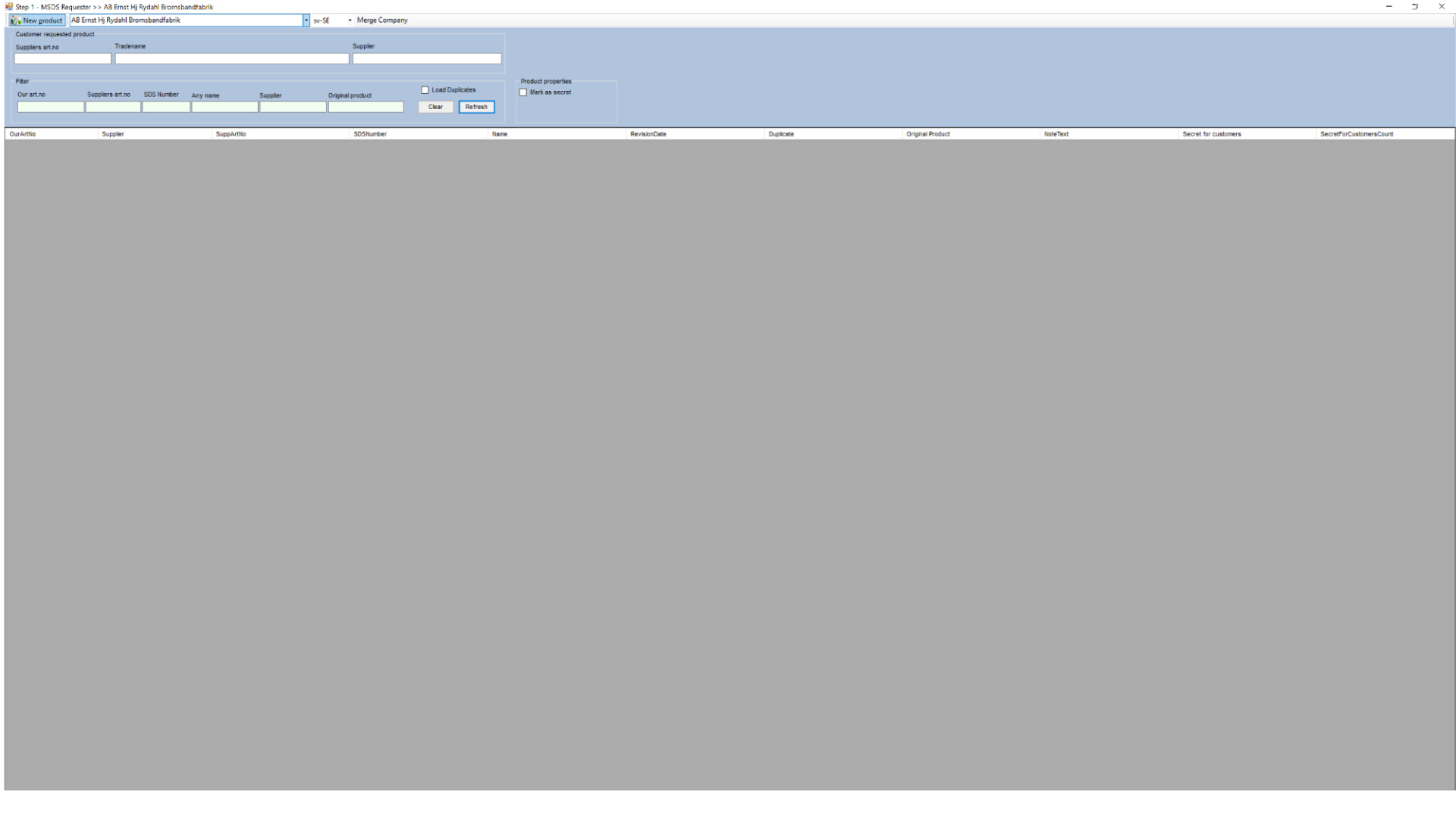
Requester: Step 1, product intake
Registering a customer-requested product. Eight filter fields, an empty result grid, and no indication of whether a search is running.
Legacy screen

Requester: Step 1, product intake

  • Grid returns empty with no empty-state or error distinction
  • Filter vocabulary ("Our art.no", "SuppArtNo") is database language, not work language
  • No feedback during the 30–60s query, users open a second window instead of waiting
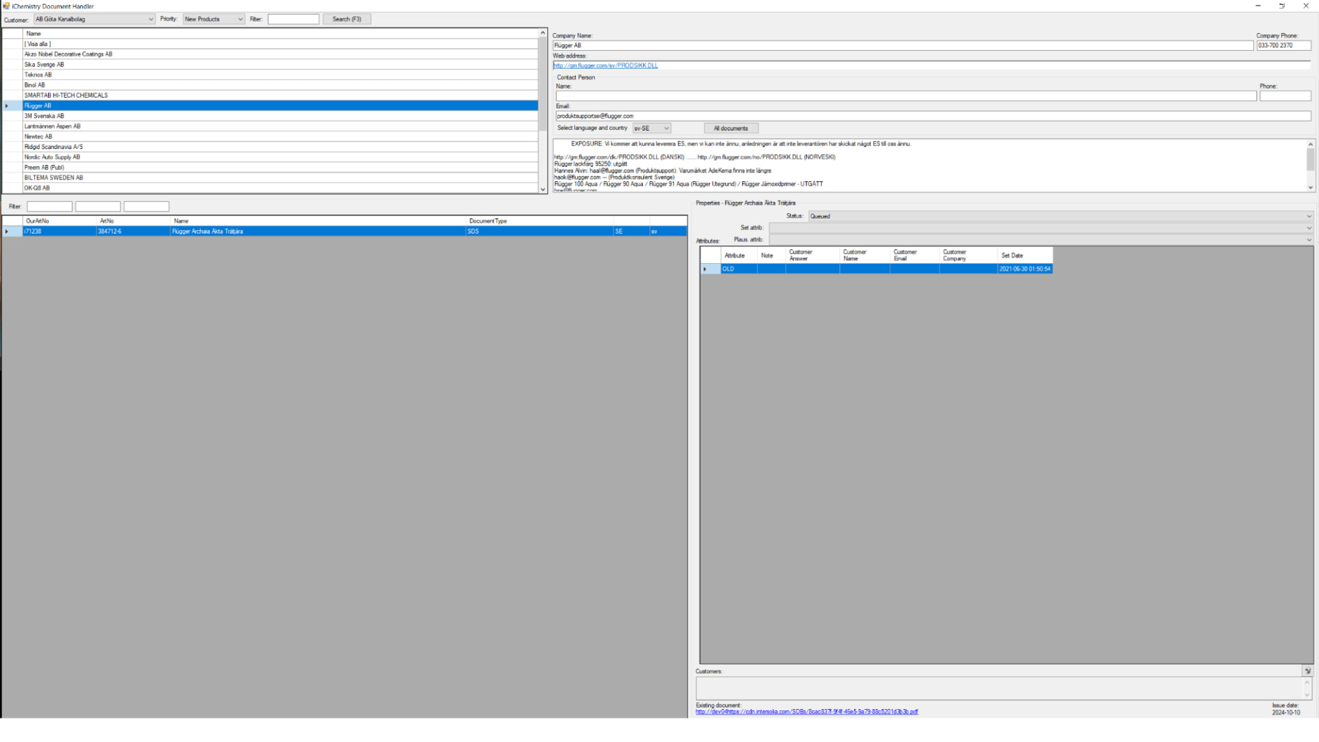
Handler: supplier and document management
Four dense panes on one screen: customer list, supplier record, document list and attribute grid, all editable, none prioritised.
Legacy screen

Handler: supplier and document management

  • Free-text notes pasted into a scroll box act as the only status history
  • Attributes ("OLD", "Queued") carry meaning nobody documented
  • Nothing links the document shown here to the request that triggered it
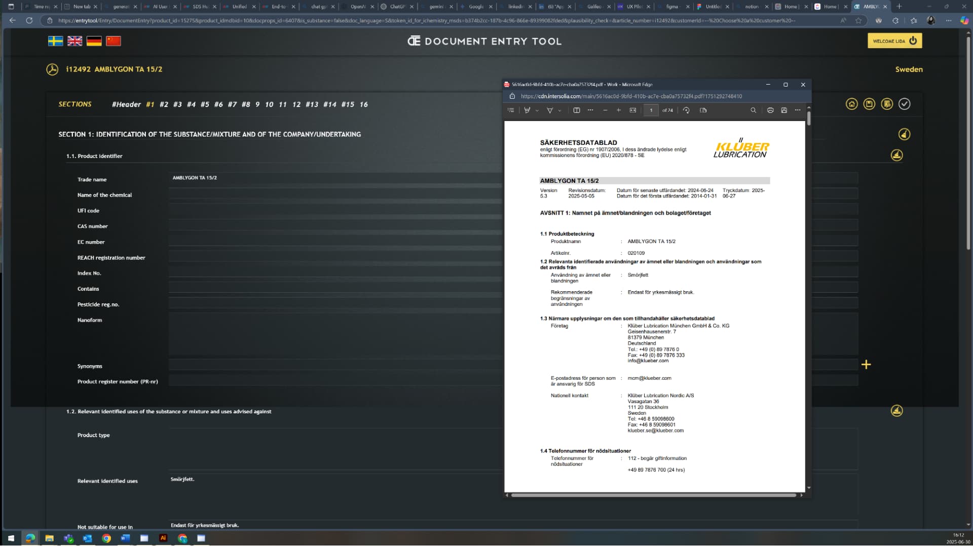
Entry Tool: 16-section data entry
A dark web form of 16 regulatory sections, filled while reading a PDF in a floating browser window next to it.
Legacy screen

Entry Tool: 16-section data entry

  • Source document and entry fields live in two unlinked windows
  • No field-level validation, confidence or provenance for any value
  • Section navigation is a row of numbers with no completion state
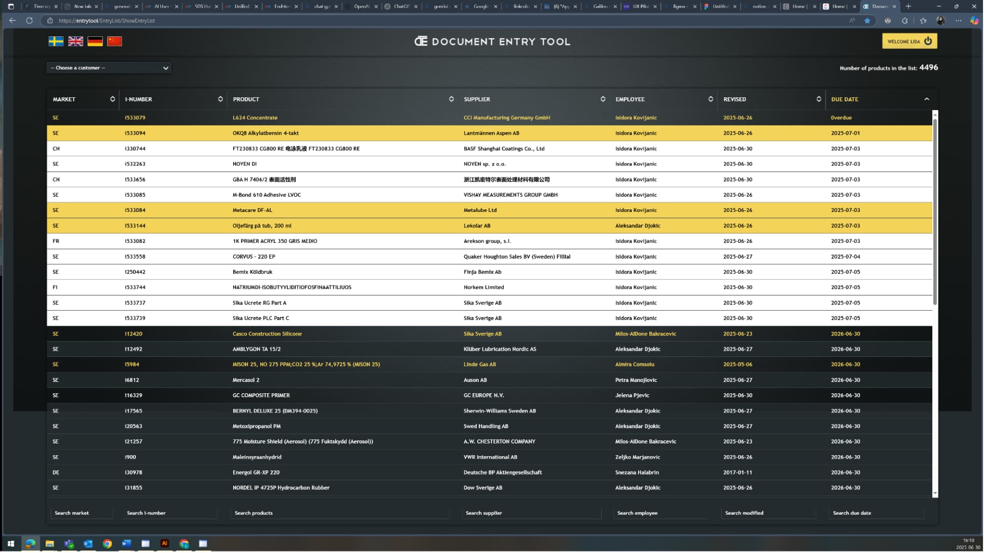
Entry Tool: 4,496-row work queue
The whole department's backlog as one flat, colour-coded table. Priority is communicated by row colour and a due-date column.
Legacy screen

Entry Tool: 4,496-row work queue

  • No grouping, no saved views, no personal workload, every user scrolls the same 4,496 rows
  • Colour is the only priority signal, and its meaning is tribal knowledge
  • Overdue items sit beside items due in 2026 with equal visual weight
02

Process

  1. 01

    Discovery

    Seven contextual interviews across Requester, Handler and Entry Tool roles, plus task shadowing and system walkthroughs over 4–5 weeks.

  2. 02

    Analysis

    Heuristic evaluation, service blueprint, journey map and a 17-item issue register scored by impact, effort and root cause.

  3. 03

    Ideation

    Remote workshops with the department manager, delivery lead and data engineer to converge on one unified architecture.

  4. 04

    Prototyping

    Mid-fi wireframes, then an AI-assisted lifecycle prototype tested with the same users who were interviewed.

  5. 05

    Handoff

    Design system, UI specs, functional-action mapping and a phased implementation roadmap.

03

Research & discovery

Contextual inquiry: users shared their screens and narrated every workaround, so I could map the flow as it happens, not as documented.

7
Contextual interviews
3
Legacy tools audited
17
Issues logged & root-caused
5
Blueprint stages mapped

Methods

  • Contextual interviews & screen-sharing walkthroughs
  • Task shadowing of live SDS updates
  • Heuristic evaluation (Nielsen's 10) of Requester and Handler
  • Service blueprint + customer journey map
  • Qualitative coding and cross-user theme mapping
  • Impact/effort prioritisation with engineering

Who I spoke to

RoleTools usedFocus
SDS Department ManagerRequester + HandlerIntake, product creation, customer links
SDS AdministratorRequester + HandlerSupplier communication, uploads, assignment
SDS CoordinatorRequester + HandlerProduct matching, new registrations
SDS Support SpecialistRequester + HandlerSupplier search, SDS updates, emails
SDS Administrator (key accounts)Requester + HandlerLarge international customers, link maintenance
Data Entry SpecialistEntry ToolValidation and publishing to iChemistry

It's 2025, and we still work in tools that look like Windows 98.

Support specialist

We have to open three Requesters at once just to work efficiently, one to register, one to match, one to search.

SDS administrator

If I upload a document, the system doesn't record my action unless I manually requeue it.

SDS administrator

AI helps, but we still have to manually review every critical section, and it's tiring.

Data entry specialist
04

What the research showed

Fragmented tools, broken handoffs

Work is split across three desktop apps with no shared state. Products are searched twice, SDS files are split manually, and notes written in one tool are invisible in the next.

Design need · One web platform with automated handoffs and built-in document handling.
Information is not discoverable

There is no global search and no filtering, so users scroll thousands of records. Duplicate suppliers and inconsistent naming make even a successful search untrustworthy.

Design need · Global search, smart filters and duplicate governance.

Instability breeds workarounds

Freezes during upload and matching, 30–60 second waits with no progress feedback, unreliable OCR. Users compensate with multiple windows, manual refreshes and Teams messages.

Design need · Async architecture, visible system status and autosave.

Errors are born upstream

Reviewing customer requests in iChemistry showed unclear product names, unrecognised existing products and missing supplier or language data, the direct source of downstream duplicates.

Design need · Validation and smart suggestions at the customer request form.

05

Heuristic evaluation

HeuristicObserved issueSeverityDesign response
Visibility of system statusNo loading feedback; users open extra windows to check whether anything is happening.CriticalProgress states, live status chips, explicit success/failure messages.
Error preventionNothing validates language or supplier before a wrong SDS is saved.MajorAuto-detected document language and supplier validation before save.
Consistency & standardsEach tool has its own layout and vocabulary for the same object.MajorOne design system and one shared product/supplier terminology.
Flexibility & efficiencyFour separate emails sent to the same supplier; data re-entered per tool.MediumBatch email with templates, task grouping, inline editing.
Help & documentationNo onboarding or in-system guidance; new staff learn workarounds from colleagues.MediumContextual help, empty-state guidance and documented flows.
06

Prioritisation

Scored with the department manager and the delivery lead, so scope reflected both daily pain and what engineering could realistically build first.

Automated matching & Excel upload

Impact: Very highEffort: Medium

Removes the single largest manual time cost in the Requester workflow.

Inline editing of product & supplier

Impact: HighEffort: Low

Daily friction; users currently depend on other teams for small fixes.

Audit trail & product timeline

Impact: HighEffort: Medium

Restores accountability and replaces email archaeology.

Async, web-based performance

Impact: Very highEffort: High

The root cause of every multi-window workaround.

Fuzzy duplicate detection & merge

Impact: HighEffort: Medium

Cleans the product base and prevents new duplicates.

Batch supplier email

Impact: MediumEffort: Low

Ends repeated one-by-one supplier contact.

07

The concept

Concept 1: One unified workbench

Requester, Handler and Entry Tool merged into a single role-based workspace: a dashboard with workload and activity timeline, a product queue with inline editing and duplicate flags, a supplier panel with batch email and advanced SDS search, and an entry panel that validates and publishes to iChemistry in the same flow.

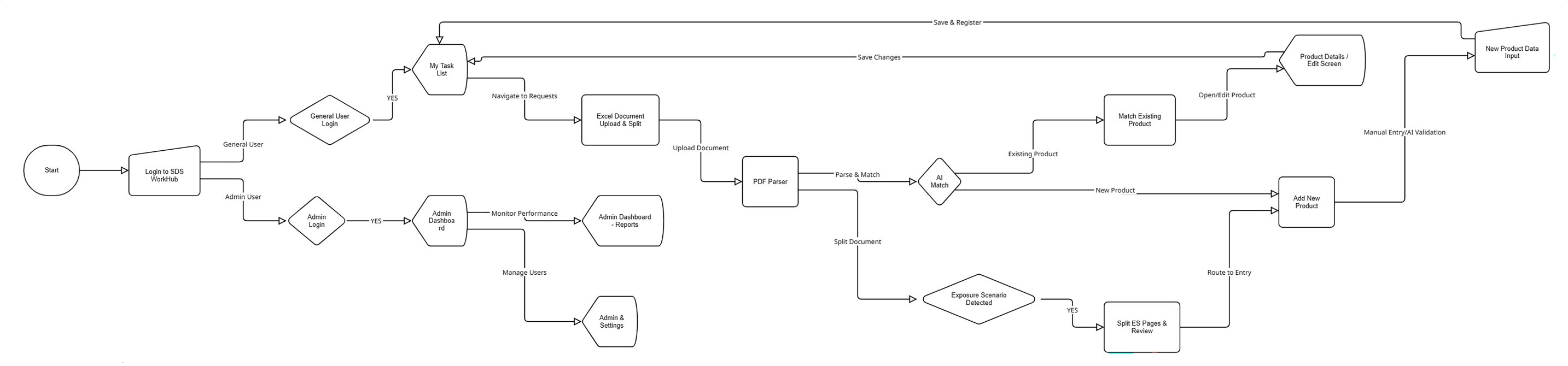
Concept 1: One unified workbench
Target user flow, login, task list, parse and match, entry routing, admin.

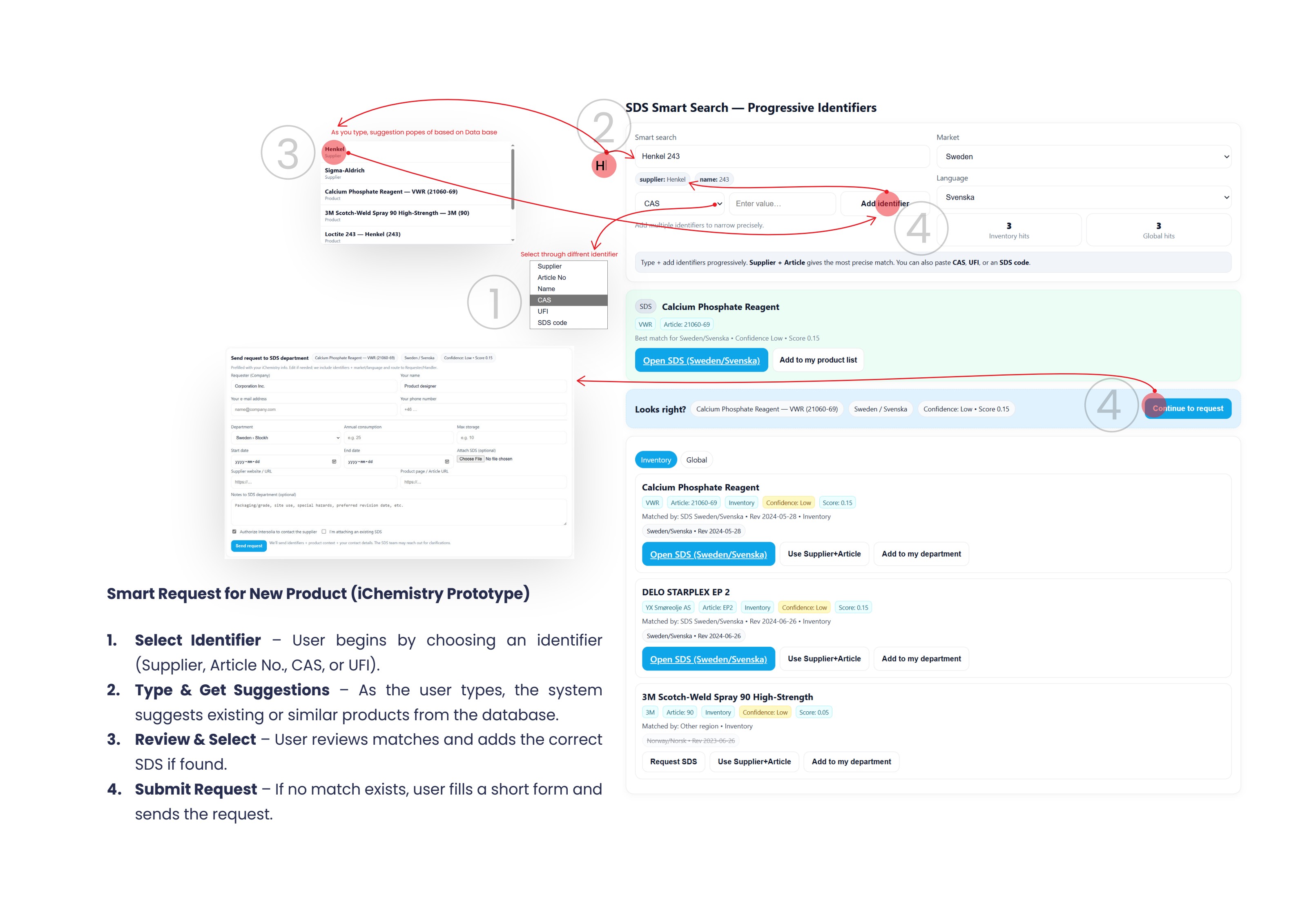
Zooming out: fixing the source, not the symptom

Halfway through, the evidence pointed upstream. Duplicates and language mismatches were created when customers submitted requests in iChemistry, where the form offered no suggestions and no validation. Moving error detection to the customer interface prevents work instead of speeding it up.

Zooming out: fixing the source, not the symptom
Smart Request prototype, progressive identifiers, live suggestions, confidence-scored matches, prefilled request.

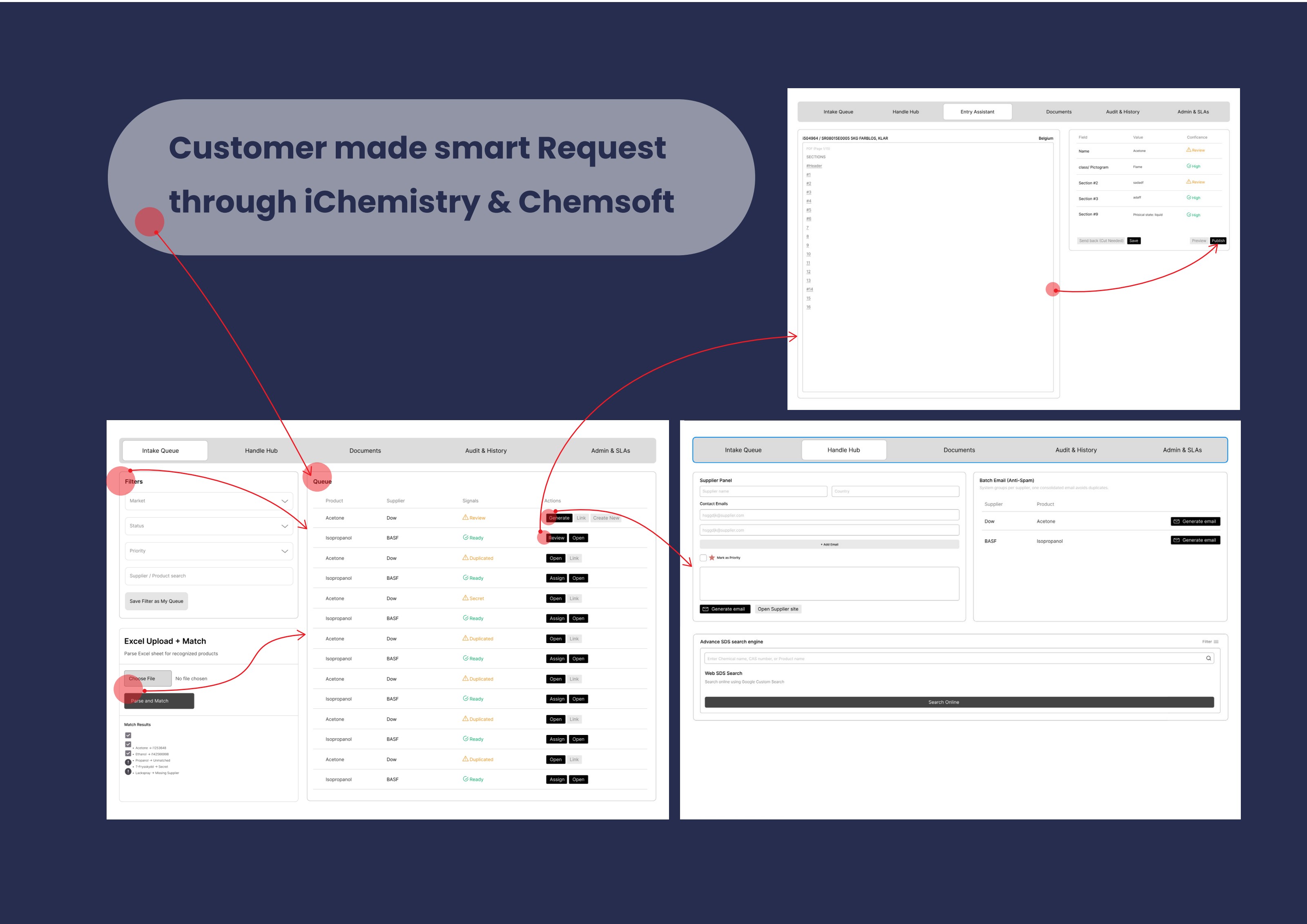
Concept 2: An AI-assisted SDS lifecycle

The final concept spans the whole request-to-publish lifecycle: Intake Queue, Handle Hub, Entry Assistant, Documents and Audit & History. AI parses documents and proposes matches, but every field carries a confidence level and a review state, the specialist stays the decision-maker.

Concept 2: An AI-assisted SDS lifecycle
Lifecycle prototype, intake queue with Excel match, handle hub with batch email, entry assistant with field-level confidence.
08

Prototypes & mockups

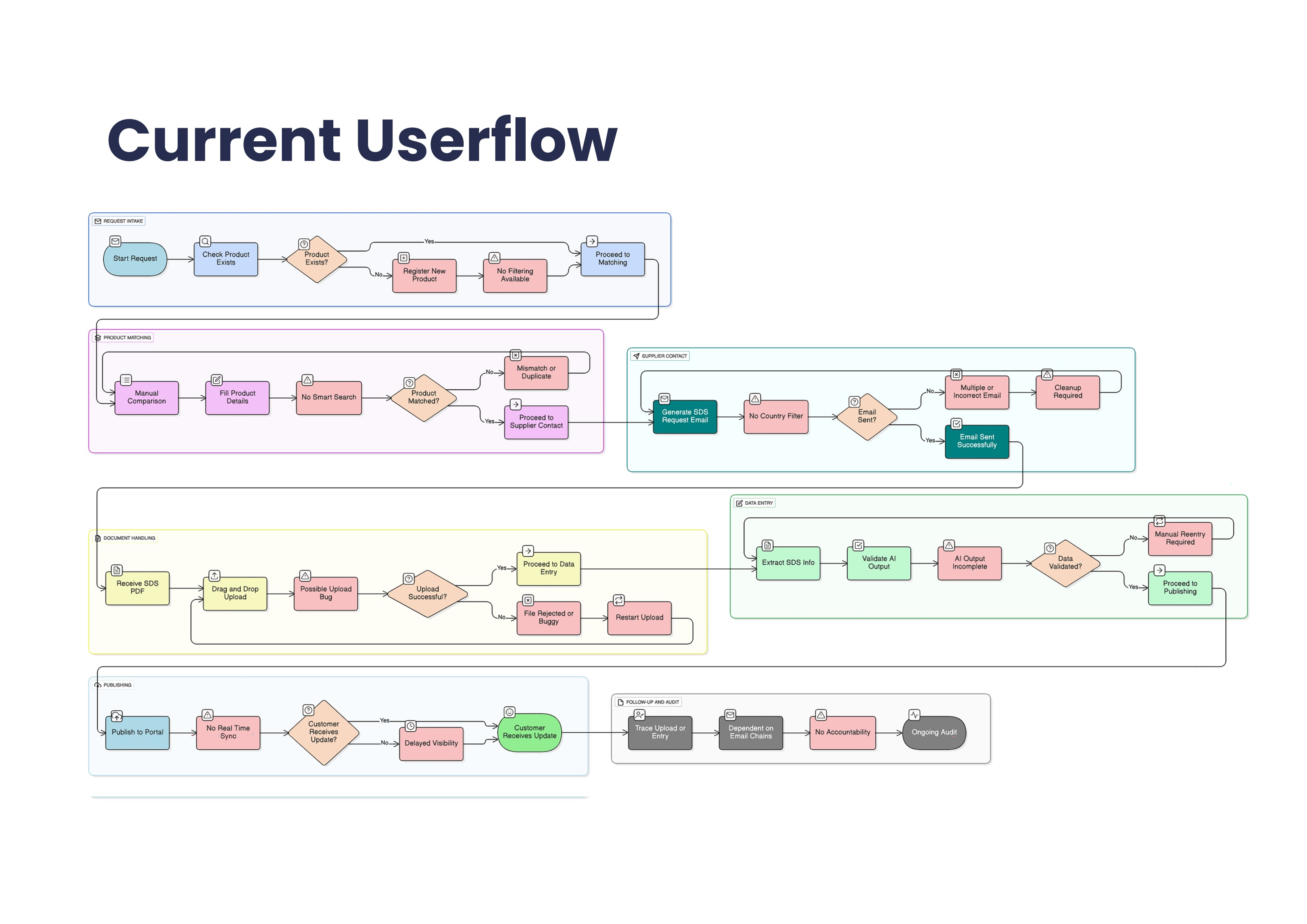
Current-state user flow

Current-state user flow
Product matching, supplier contact, document handling and publishing as they work today, including the failure branches users live with.

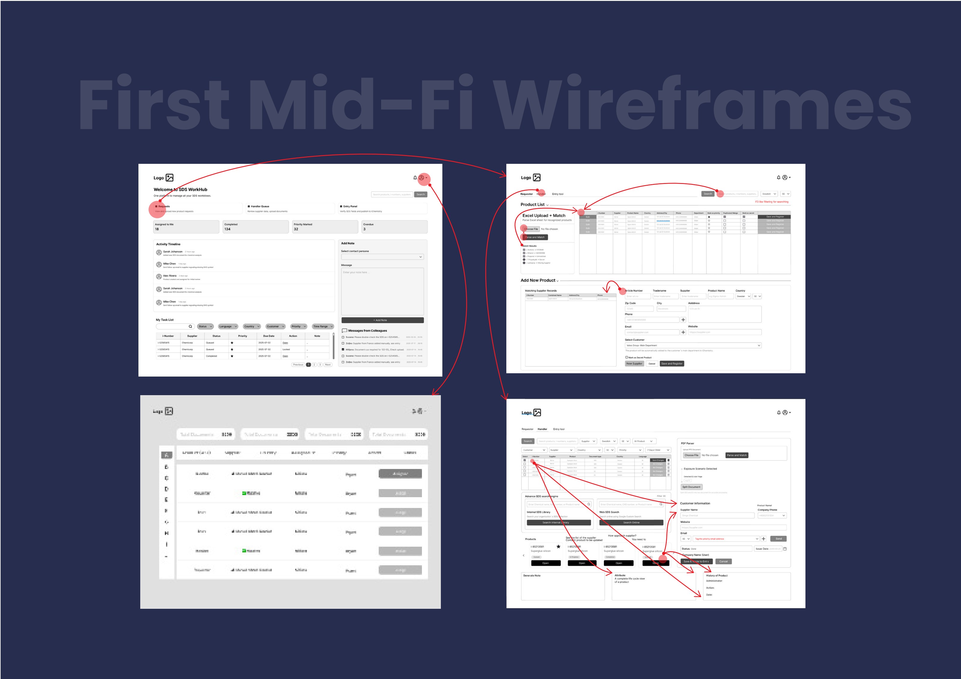
First mid-fi wireframes

First mid-fi wireframes
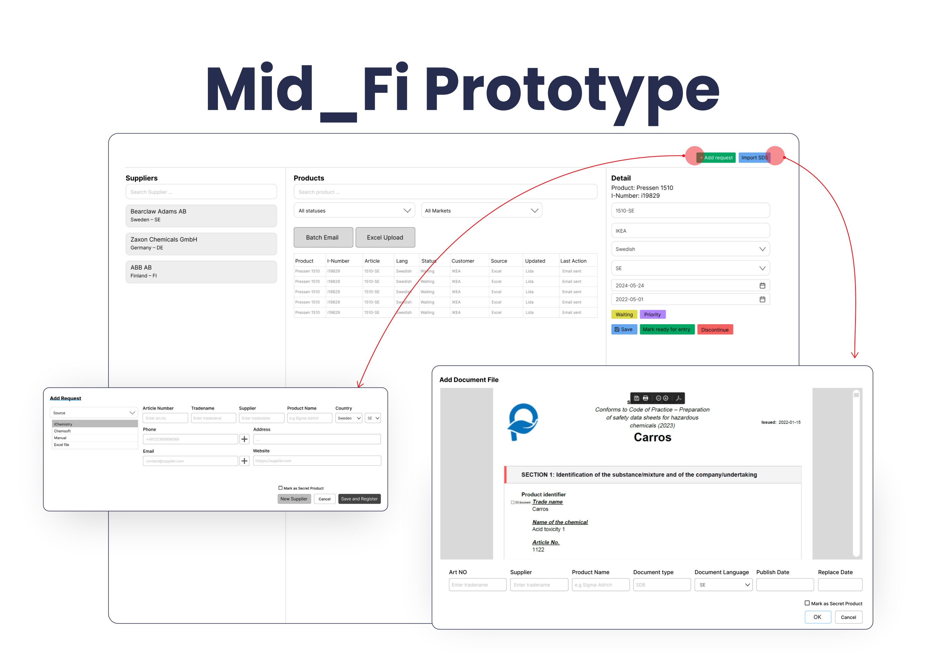
Dashboard, product list with Excel upload and match, and the handler view with PDF parser and customer information.

Mid-fi prototype

Mid-fi prototype
Three-pane workbench (suppliers, product queue, detail) plus the add-request and document-import dialogs.

High-fidelity lifecycle

High-fidelity lifecycle
Intake Queue, Handle Hub and Entry Assistant with confidence indicators and explicit publish actions.

Final UI: WorkHub workbench

Final UI: WorkHub workbench
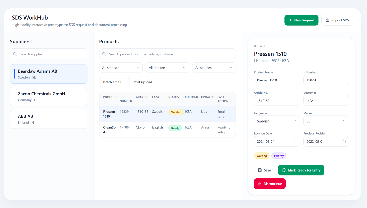
Suppliers, product queue and detail panel in one screen. Status, market and source filters sit above the queue; the detail panel keeps Save, Mark Ready and Discontinue visible without leaving context.

Final UI: structured new request

Final UI: structured new request
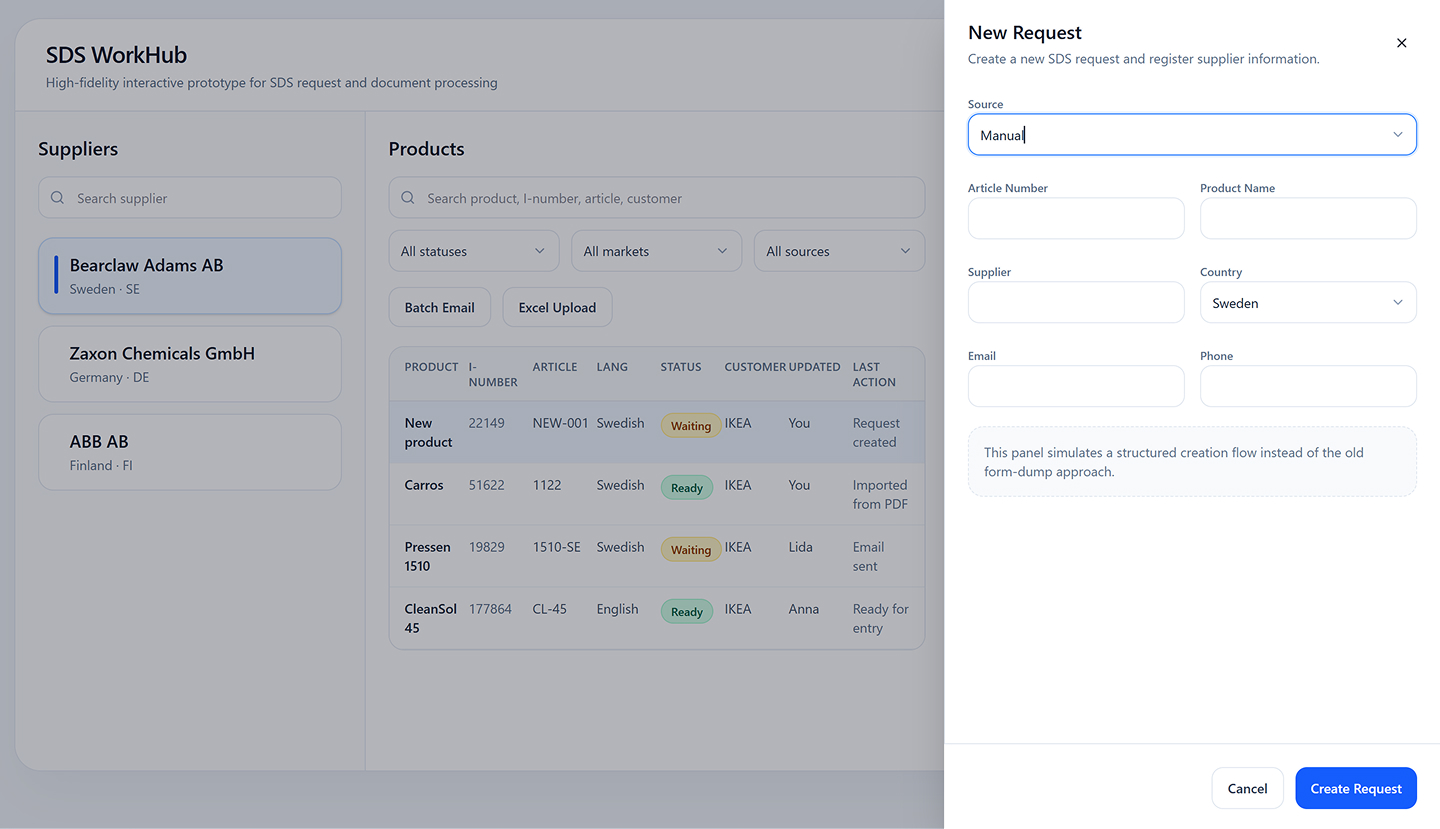
A guided side panel replaces the old form dump. Source drives which identifiers are asked for, so a request cannot be created without the fields the handler will need later.

Final UI: SDS import

Final UI: SDS import
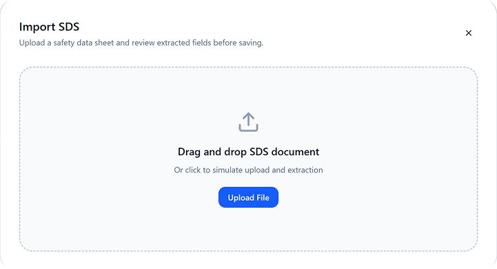
Drag-and-drop intake for supplier documents, one clear primary action and no hidden upload rules.

Final UI: extraction feedback

Final UI: extraction feedback
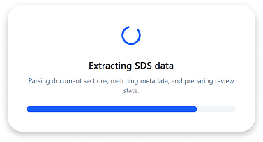
Parsing is narrated rather than silent, so the specialist knows what the system is doing and how far along it is.

Final UI: review extracted data

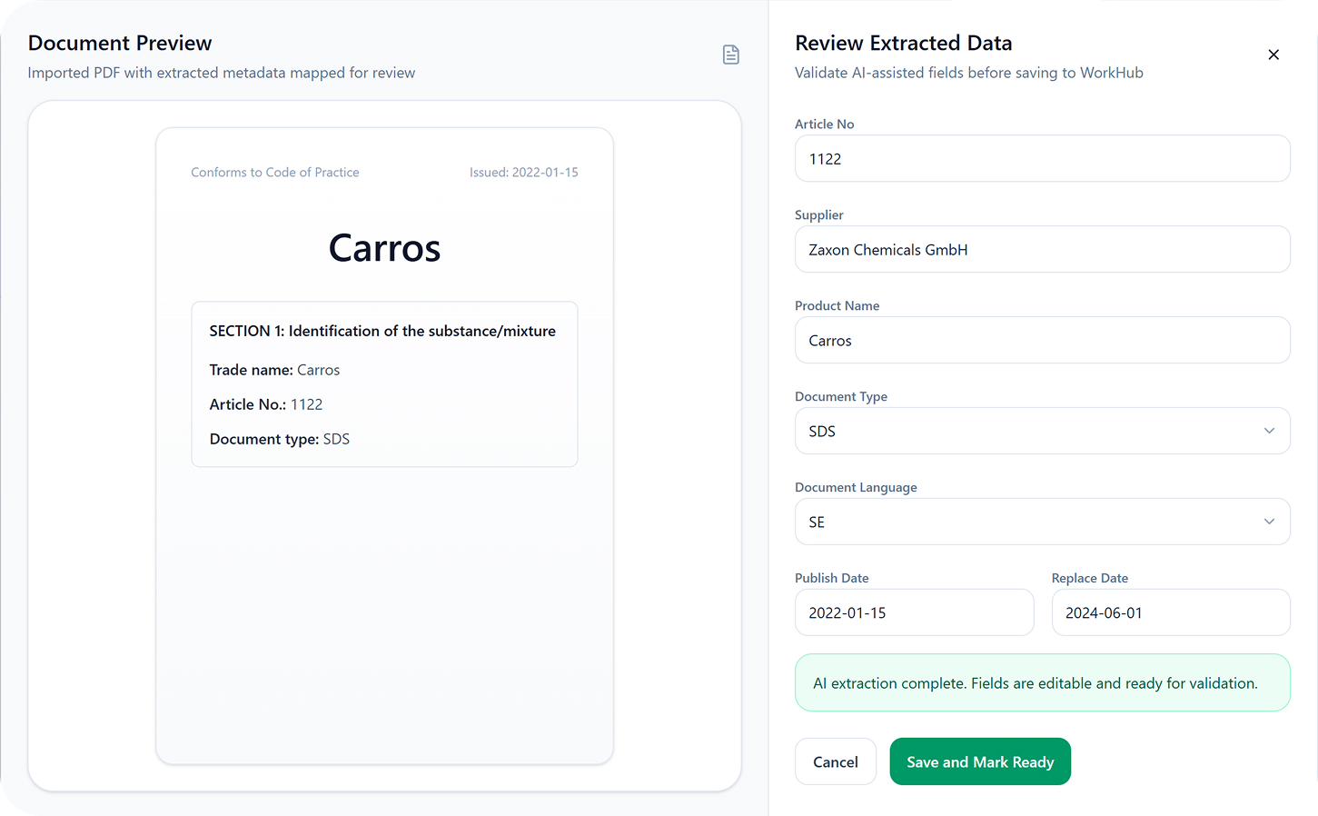
Final UI: review extracted data
Document preview beside editable extracted fields. Every AI-filled value is reviewable before Save and Mark Ready, keeping the specialist the decision-maker.
09

Design decisions

Show confidence, never silent automation

AI output is labelled High or Review at field level. Anything below the threshold blocks publishing until a human confirms it, automation earns trust by being auditable, not by hiding.

Status is a system fact, not a manual chore

Statuses propagate automatically between intake, handling and entry. The old habit of setting a product back to 'queued' by hand disappears with the tools that required it.

One object, one vocabulary

Product, supplier, document and request are named identically everywhere, which removed the translation layer users carried between three interfaces.

Every action is attributable

The audit trail records who did what and when, with notes attached to the product rather than to a chat thread.

Prevent, then assist, then correct

Validation at the request form, AI assistance during handling, safe correction (inline edit, delete, merge) afterwards, in that order of priority.

10

Usability testing

Five moderated think-aloud sessions on the clickable prototype, with specialists from discovery. I measured unaided completion, hesitation and confidence, not raw speed.

Participants
5 of the 7 originally interviewed (intake, handling, entry)
Format
Remote moderated, 45 min, think-aloud, screen-shared
Prototype
Figma high-fidelity, 5 lifecycle areas, clickable end-to-end
Measures
Task completion, unaided success, hesitation points, 1–5 confidence
TaskIn the legacy toolsPrototype resultWhat I learned
Find a specific product and open its historySearch in two tools, no history exists5/5 unaidedGlobal search plus the product timeline replaced what used to be an email search.
Import a customer Excel and review matchesManual line-by-line matching4/5 unaidedOne user missed the match-summary step; a result summary panel was added after upload.
Contact three suppliers about missing SDSThree separate emails, no record5/5 unaidedBatch email with templates; participants asked for a visible 'last contacted' date, which I added.
Publish an AI-parsed sheet with a low-confidence fieldNo confidence signal at all3/5 unaidedBiggest failure. 'Review' chips read as decoration; I made low-confidence fields block publish and surface a review counter.
Explain who last changed a status and whenNot answerable in the system5/5 unaidedAudit trail answered it in one click, the change participants reacted to most strongly.

What changed because of the test

  • Confidence chips became a blocking review state with a counter in the publish bar, after 2 of 5 participants published a low-confidence sheet without noticing.
  • Excel import gained an explicit match-summary screen (matched / ambiguous / new) instead of dropping users straight back into the queue.
  • Navigation between the five lifecycle areas was flattened into a persistent left rail after users lost their place returning from Documents.
  • Supplier rows gained a 'last contacted' timestamp, requested independently by three participants.
  • Average self-reported confidence in 'knowing the system recorded my action' moved from 2.0 to 4.6 out of 5 across the session set.
11

How success will be measured

Interactive prototypes were tested with the same specialists interviewed in discovery, focused on filters, AI flags and navigation between queue, hub and entry.

Feedback drove clearer confidence labelling, a visible match-result summary after Excel upload, and simplified navigation between the five lifecycle areas.

Success metrics agreed for launch: time per matched product, duplicate rate, share of requests auto-validated at intake, and number of supplier emails per product.

12

Outcomes

Three tools became one role-based workbench with automated handoffs, a product no longer changes system to change status.

Error prevention moved upstream: the request form validates supplier, market and language before work is created.

Every action writes to an audit trail, replacing Teams threads as the record of what happened.

Figures are targets agreed with the department during prioritisation; the platform is in prototype validation.

13

Reflection

The most valuable decision was leaving the brief. I was asked to redesign internal tools; the research showed a share of the workload was manufactured upstream by a customer form nobody had questioned.

Working with the data engineer early kept the concept buildable, traceability and matching were designed against the real entity model, not around it.

If I ran it again I would instrument the legacy tools first. The qualitative evidence was overwhelming, but baseline timings would have made the business case immediate.

Next

More case studies

Have a similar problem?

I'm available for product design roles and consulting projects.

contact@lidatohidi.com