FiboDex, decentralised finance ecosystem · 2019–2022

FiboDex

A decentralised exchange that had to serve a first-time buyer and a professional developer on the same screen. Brand, architecture and a two-theme design system, built end to end.

My role
Lead designer: research, brand, IA, UX, UI, design system
Timeframe
Multi-phase engagement, 2019 to 2022
Status
Delivered
FigmaDesign systemBrandingFintech
FiboDex for FiboDex, decentralised finance ecosystem, interface preview
8
In-depth interviews, 15 questions each
2
Themes: light and dark, one token set
4
Product lines under one architecture
1
Documented UI kit for handoff

Trust in decentralised finance is a design output, not a marketing claim. FiboDex earns it by making the first transaction understandable and the thousandth one fast.

01

The problem

FiboDex wanted one ecosystem for exchange, NFTs, in-game assets and tangible asset records, on its own chain. Every one of those products speaks a different language, and the platform had no shared one.

The audience splits hard: beginners who abandon at the first wallet dialog, and developers who leave if the tooling is shallow. Designing for the average of the two would have failed both.

Market data is unforgiving. Real numbers, real money, no room for a screen that looks calm but reads slowly.

The brand read as another generic crypto startup, so trust had to be designed before any dashboard could be believed.

02

Process

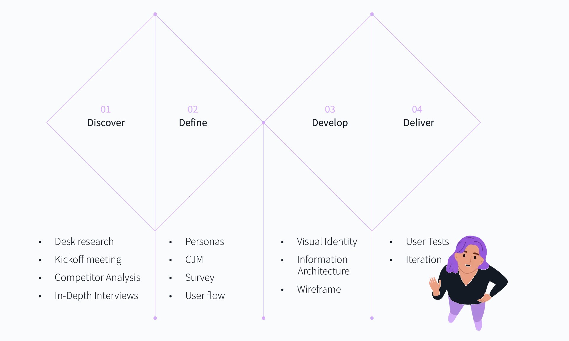
  1. 01

    Discover

    Competitive teardown of exchanges and NFT marketplaces, eight 60-minute interviews across investors, developers and beginners, stakeholder alignment on the ecosystem scope.

  2. 02

    Define

    Two primary personas, journey maps per persona, and an information architecture that separates trading, assets, developer tools and learning.

  3. 03

    Develop

    Brand identity built on a Fibonacci construction grid, user flows, wireframes, then a light and dark design system with documented components.

  4. 04

    Deliver

    High-fidelity screens for onboarding, fast buy, trading, portfolio and profile, plus handoff documentation and social/brand applications.

03

Research & discovery

The brief assumed one audience. The interviews showed three, with directly opposing definitions of a good platform. That contradiction became the design problem.

8
Participants
60 min
Per session
15
Structured questions
3
Distinct user groups

Methods

  • Competitive analysis of established exchanges, NFT marketplaces and wallet onboarding flows
  • Eight in-depth interviews, 60 minutes each, across investors, developers and blockchain beginners
  • Stakeholder sessions to map the ecosystem's business goals onto user value
  • Persona development and customer journey mapping for the two priority segments

Who I spoke to

RoleTools usedFocus
InvestorsCentralised exchanges, portfolio trackersReal-time data, reliability, portfolio clarity
DevelopersNFT tooling, smart-contract stacksAPIs, sandbox, documentation, deployment control
BeginnersMobile banking, occasional crypto appsPlain language, guided steps, safety

I want to dip my toes into blockchain investment, but it all seems overwhelming and complicated.

Emma, beginner investor persona, grounded in interview data

I need a platform that does not just cater to beginners but offers advanced tools and support for developers like me.

Leo, blockchain developer persona
04

What the research showed

Beginners quit at the vocabulary, not the maths

Participants understood risk perfectly well. What stopped them was interface language: gas, slippage, custody, network. Every unfamiliar word was read as a possible way to lose money.

Design need · Plain-language labels first, technical terms available on demand, never the other way round.
Real-time data is the reason investors stay

Delayed or ambiguous numbers destroyed confidence faster than any visual flaw. Participants wanted to know when a figure was last updated and whether it was live.

Design need · Timestamped, clearly live market data with explicit states for stale and unavailable.

Advanced users want to rearrange, not be guided

Developers and active traders described guided flows as friction. They wanted configurable dashboards, saved layouts and keyboard-speed access to order types.

Design need · Progressive disclosure that scales up, not just down: expert density as a deliberate mode.

Security is expected to be visible

Multi-factor authentication, session logs and transparent transaction records were treated as table stakes. Users wanted to see the protection, not read about it.

Design need · Security surfaces inside the product, in the profile and confirmation flows.

Developers judge a chain by its documentation

API access, a sandbox environment and worked examples were the deciding factors in whether a developer would build on FiboDex at all.

Design need · A developer area treated as a product, not a footer link.

Learning has to sit next to doing

Tutorials in a separate help site were never opened. Participants wanted the glossary at the moment of the unfamiliar word.

Design need · Inline learning: contextual definitions, then a knowledge base for depth.

07

The concept

Double Diamond, applied to a four-product ecosystem

Discover and define ran wide across all four product lines before anything was drawn. Develop and deliver narrowed to the two journeys that carry the business: a beginner's first purchase and a developer's first deployment.

Double Diamond, applied to a four-product ecosystem
The framework used to move from a broad ecosystem brief to two priority journeys.

Two personas, one interface, no compromise average

Emma needs to buy her first token without feeling exposed. Leo needs to list, monitor and debug NFT projects. Rather than averaging them, the interface layers: a guided surface on top, full depth one step beneath it.

Two personas, one interface, no compromise average
Emma and Leo, the two personas that governed every prioritisation call.

Journey mapping the developer, from awareness to advocacy

The developer journey exposed where the platform loses credibility: unclear documentation at onboarding and no visibility into listed NFTs during usage. Both became architecture requirements, not backlog items.

Journey mapping the developer, from awareness to advocacy
Customer journey map: actions, thoughts, pain points, emotion and opportunity per stage.

An identity built on the Fibonacci sequence

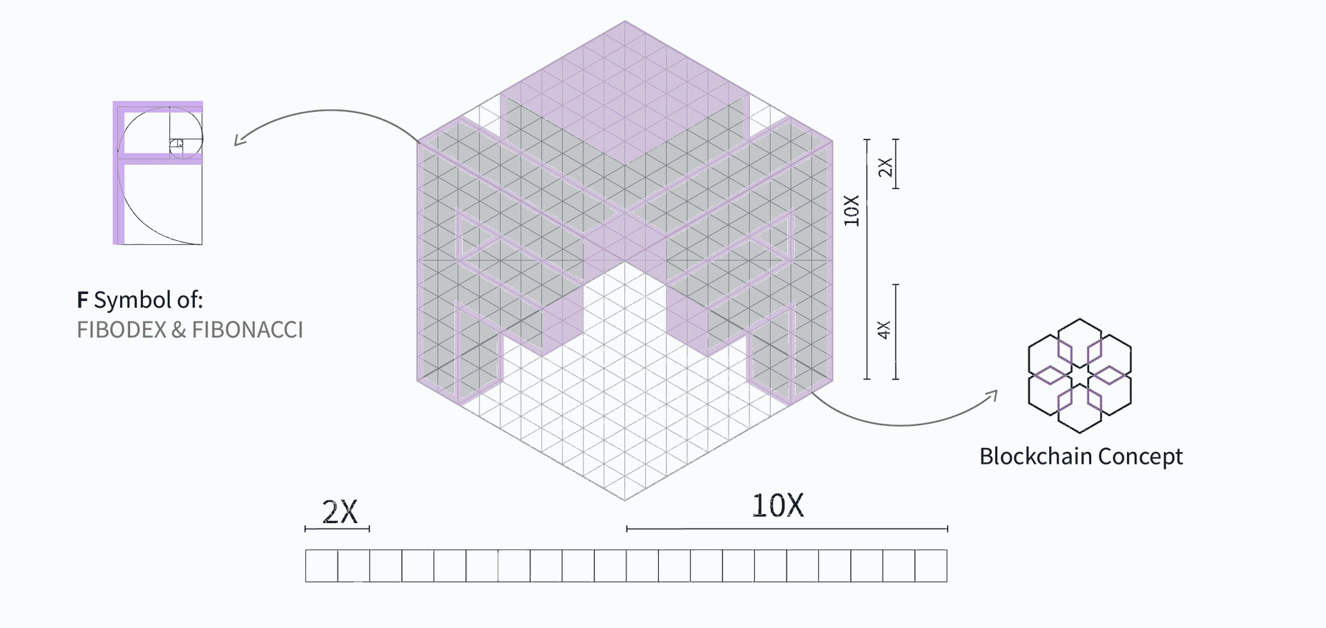
The mark is an isometric F constructed on a Fibonacci grid, with a blockchain lattice as its texture. Green for growth and trust, purple for innovation and ambition. The construction is literal so the story survives explanation.

An identity built on the Fibonacci sequence
Logo construction: Fibonacci grid, isometric form, blockchain lattice.

Architecture that keeps four products from colliding

Trading, asset management, developer tools and the learning centre each own a top-level branch. Cross-links are deliberate: a token in the portfolio links to its market, an unfamiliar term links to the glossary.

Flows written for the failure cases

The account flow was designed around what goes wrong: wrong password, no account, network choice, unverified email. Every dead end has a labelled way out, because in finance a confused user assumes theft.

Flows written for the failure cases
Sign-up and login flow including error and recovery branches.
08

Prototypes & mockups

Sign in

Sign in
Brand-led authentication with a single visible task and a clear route back to registration.

Fast Buy

Fast Buy
Emma's path: local currency in, token out, three labelled steps and the amount always visible.

Profile and security

Profile and security
Verification, two-factor status and anti-phishing settings shown as states, not buried in menus.

Campaign system

Campaign system
Social templates using the same tokens as the product, so marketing and interface stay one brand.
4 screens
09

Design decisions

Layer the interface instead of averaging the users

Fast Buy and the full trading module are the same product at two depths. Beginners never see order types they cannot use; advanced users reach them in one action, with no beginner wrapper to dismiss.

Design the numbers before the layout

Tabular figures, aligned decimals, a fixed set of change colours and a defined stale state came first. In a data-intensive product the type scale for numerals is the design system's backbone.

Treat dark mode as a specified theme

Both themes were tokenised together, with contrast checked on the same components. Dark mode is where traders actually sit, so it could not be a late inversion of the light palette.

Put learning inside the transaction

Glossary definitions appear at the term, in context, and link out to the knowledge base for depth. The separate tutorial site pattern was rejected: interviews showed nobody leaves a transaction to read.

Make security legible

Verification level, two-factor state and device history are shown as plain statuses in the profile, and confirmations restate what is about to happen in human language before it is signed.

Ship a documented kit, not a screen set

Components, states, spacing and usage rules were documented so the developer team could extend the platform without inventing a fifth table style.

11

How success will be measured

Persona and journey work was reviewed with stakeholders and industry experts against the eight interviews, so priorities traced back to evidence rather than opinion.

Flows were walked task by task with beginner and developer participants: create an account, make a first purchase, find a definition, list an NFT.

Both themes were checked for contrast and numeric legibility on the same components before handoff.

The design system was handed over with documentation so consistency is verifiable at build time, not negotiated per feature.

12

Outcomes

One identity and one component language now cover exchange, NFT store, game assets and developer tooling.

Beginners get a guided fast-buy path; advanced users get depth without the beginner scaffolding in the way.

Dark mode is a first-class theme, not an inverted afterthought: contrast and numeric legibility were specified per token.

13

Reflection

The strongest decision was refusing the compromise interface. Two clearly served audiences beat one blended one, and layering made that affordable.

Brand and product had to be designed together. A trustworthy dashboard inside an untrustworthy identity still reads as risk.

If I ran it again I would instrument the first-purchase funnel from day one; the qualitative signal was strong but drop-off numbers would have settled several arguments faster.

Working across four product lines taught me to design the architecture as the contract. Once the branches were agreed, individual screens stopped being debated in isolation.

Next

More case studies

Have a similar problem?

I'm available for product design roles and consulting projects.

contact@lidatohidi.com